
Coaching For Wholly Living: Building a Wellness Education Platform from Concept
Wellbeing & HealthComplete Brand Identity, Website & Course Platform
Client: Coaching For Wholly Living
Project Type: Brand Identity + WordPress to Squarespace Migration + Website Rebuilt + Member Area, Landing Pages, Course Platform Development
Duration: Website and branding 4 weeks, course development 1.5 years ongoing
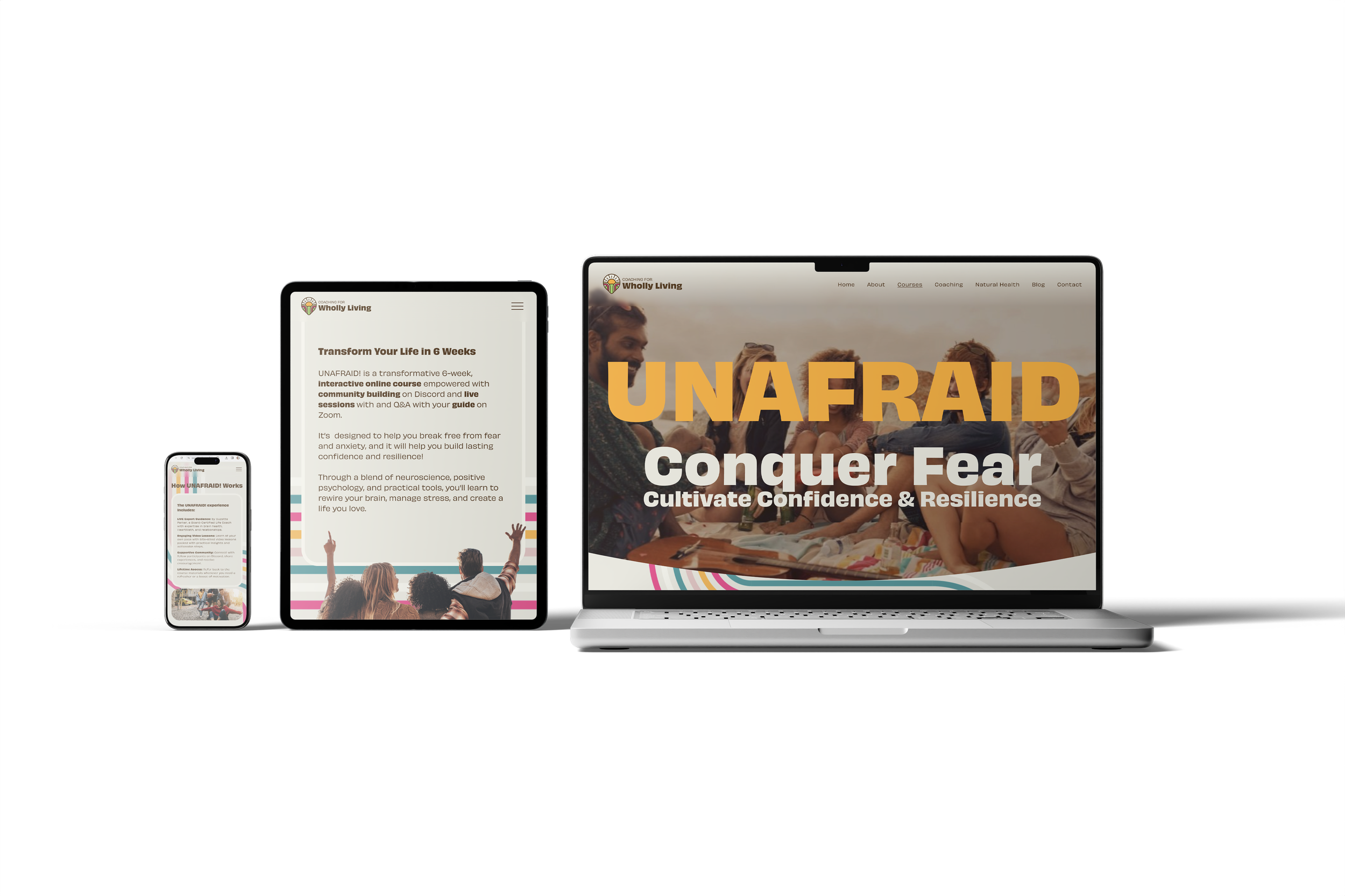
A wellness coach launching a course for young adults needed complete digital infrastructure. I created the brand identity, migrated and redesigned their website, then built a comprehensive course platform with 30 lessons across 6 modules, member areas, multiple pricing tiers, and integrated marketing systems.
The Challenge
Coaching For Wholly Living existed as a vision: helping young adults overcome anxiety through brain health education and practical strategies. The founder had expertise and content but lacked the digital foundation to deliver it effectively.
The existing WordPress website wasn't suited for course delivery, the brand lacked visual cohesion, and no systems existed for managing members, processing payments, or delivering educational content at scale. The project required building everything from brand identity through course platform launch.

Strategic Approach: Foundation Before Features
Rather than jumping directly into course development, I established the brand foundation first. Visual identity needed clarity before building the platform that would communicate it.
Logo design established the brand's approachable yet professional character—accessible wellness coaching without clinical coldness. The colour palette, typography, and visual system supported this positioning across all touchpoints.
Brand guidelines documented these decisions, ensuring consistency as the platform expanded and additional marketing materials developed.
Complete Brand Identity System
The brand identity work formed the visual foundation for every aspect of the platform. I created a 13-page comprehensive brand guidelines document including:
Logo Design: Created primary logo featuring a symbolic sun emblem (representing resilience and transformation) with full-colour and monochrome versions. Developed secondary circular badge logos for social media and compact applications. Designed variant logo formats including standalone emblem for favicons and signature lockup incorporating the coach's name for personalised materials. Each variation maintained brand recognition whilst adapting to different spatial constraints and use cases.
Colour Palette: Developed a 10-colour strategic palette split into primary and secondary systems. Primary colours conveyed hope, joy, and optimism inspired by Gen-Z and Millennial aesthetics. Secondary colours added retro '90s vibes representing fun and fulfilling life. Each colour carried specific psychological meaning aligned with wellness coaching positioning.
Typography System: Selected Obviously font family (Light, Regular, Bold weights) for primary typography paired with Brittany script for signature elements and personal touches. Established complete typographic hierarchy across four headline levels, three paragraph styles, button text, and link formatting. Guidelines specified exact font weights, sizes, line heights, and spacing for both digital and print applications, ensuring consistent professional yet approachable character throughout all materials.
Logo Meaning & Symbolism: Developed comprehensive brand story around the sun symbol—representing unwavering strength, enduring energy, resilience, and transformation. The sun's consistent presence mirrors the resilience cultivated within clients, creating emotional connection between visual identity and coaching philosophy.
Visual Language: Created mood board defining photography style (warm, authentic, retro-inspired imagery with diverse representation), colour application examples, and overall aesthetic direction. Guidelines covered graphic treatments, layout principles, and tone of visual communication across all touchpoints.
Compiled these elements into detailed brand guidelines documenting every design decision, ensuring consistency as the platform expanded and additional marketing materials developed. The guidelines provided clear direction for implementing the brand across website, course materials, social media, print collateral, and future applications whilst maintaining flexibility for growth.


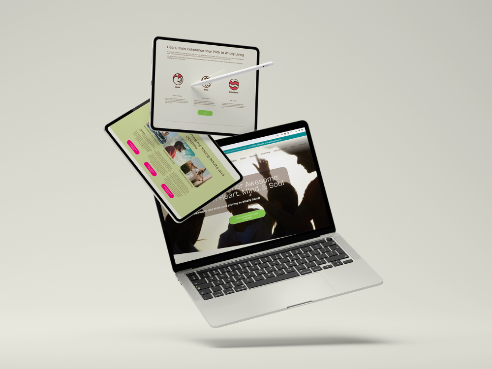
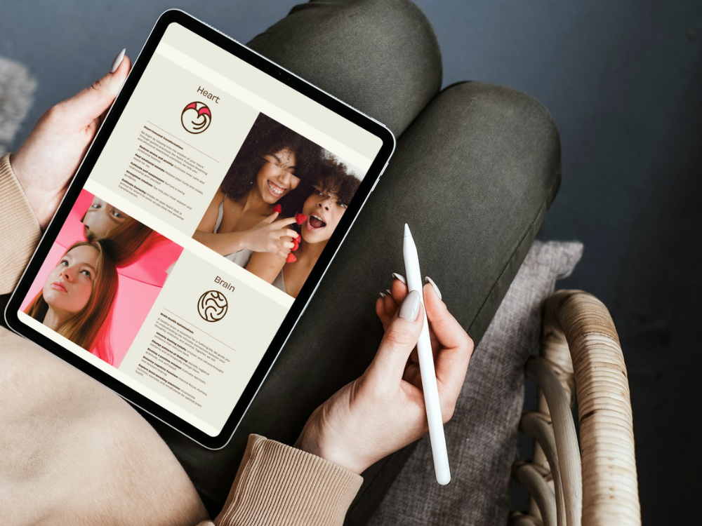
Custom Icon System: Visual Language for Complex Concepts
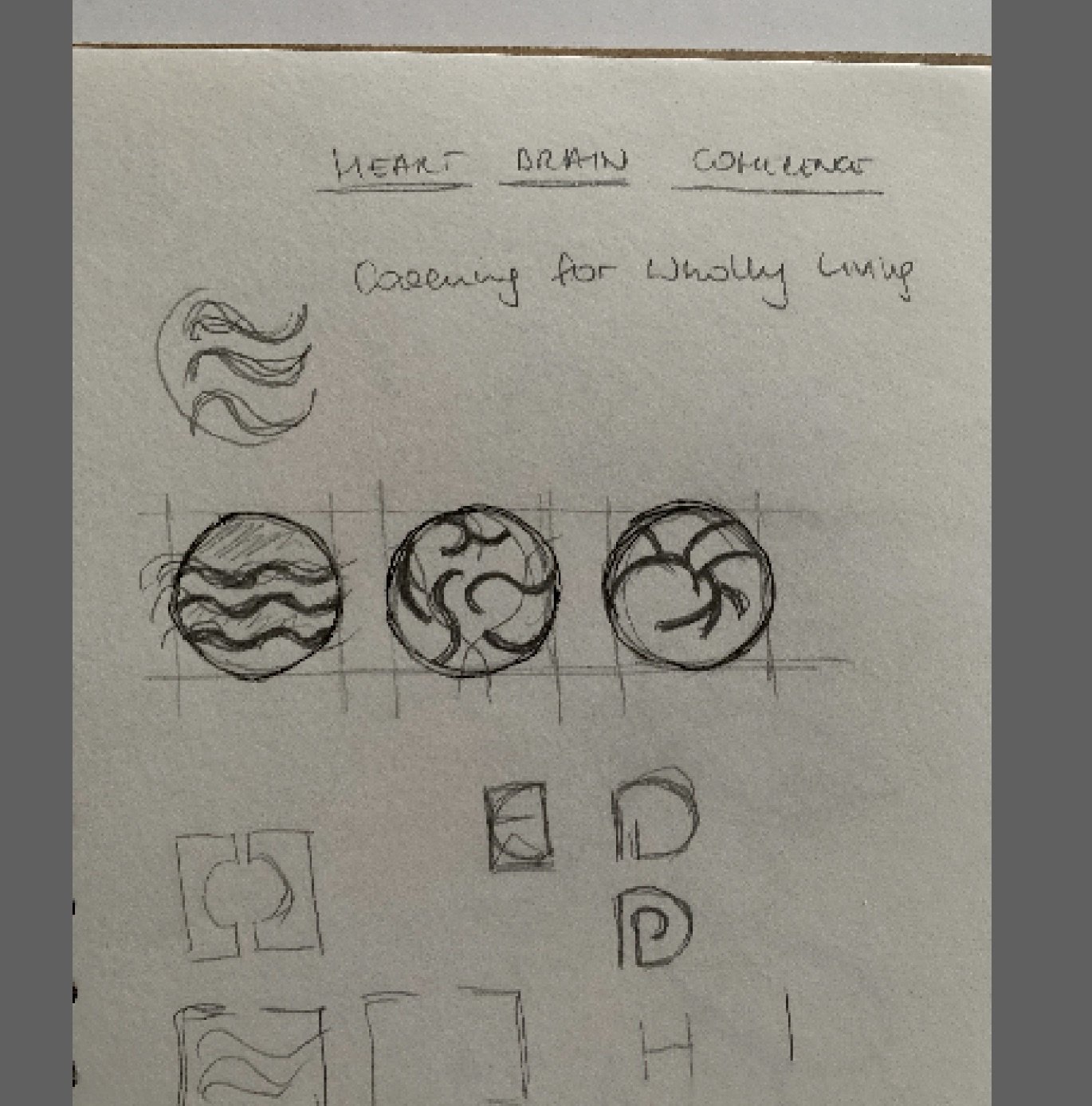
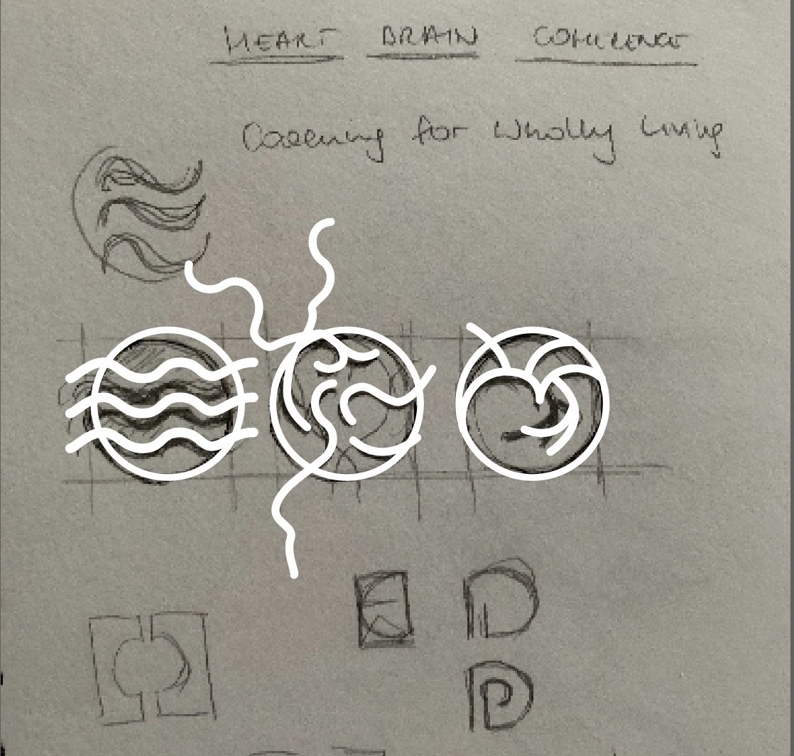
A significant component of the brand identity work involved creating a custom icon library conceptualised as "A Harmonious Trio"—three core symbols representing the interconnected pillars of the coaching philosophy.
I designed three primary icons forming the foundation of the visual system:
Heart (Heart Centered): The emotional center, radiating positivity and strength
Brain (Brain Health): The intellectual center, harnessing mental power and positive mindset
Coherence (Get in Sync): The harmonious alignment of heart and brain, creating a life of purpose and fulfillment
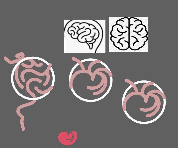
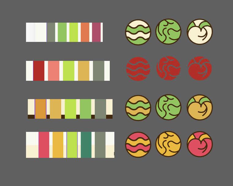
Each icon maintained consistent line weight, rounded corners, and circular composition, creating a unified design language that mirrored the sun symbolism in the main logo. The icons appeared in both full-colour (using the vibrant brand pink and green) and monochrome versions for versatility across applications.
These symbols appeared throughout the course materials, website navigation, downloadable PDFs, lesson headers, and promotional materials. The "Harmonious Trio" concept reinforced the coaching methodology visually—just as the sun nourishes all living things, the approach nurtures the interconnectedness of heart, brain, and coherence to foster wellbeing. The icon system became an essential part of the brand's visual vocabulary, making complex neurological and psychological concepts immediately recognisable and approachable.
Design Process: From Concept to Completion
The icon system began with hand-drawn explorations of how to visually represent the three pillars - Heart, Brain, and Coherence. Early sketches tested different symbolic approaches: abstract waves, anatomical references, and geometric interpretations.
After exploring variations, the final circular forms emerged - each maintaining consistent line weight whilst expressing its unique concept. The colour palette was tested across multiple combinations before selecting the vibrant pink and fresh green that balanced energy with approachability.
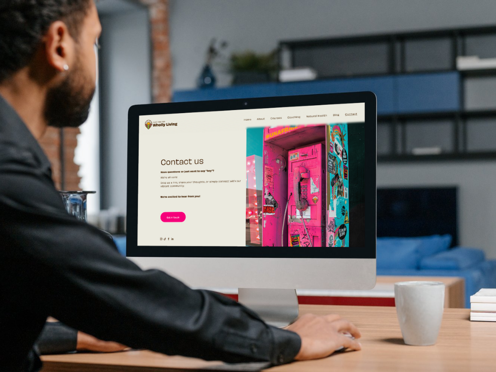
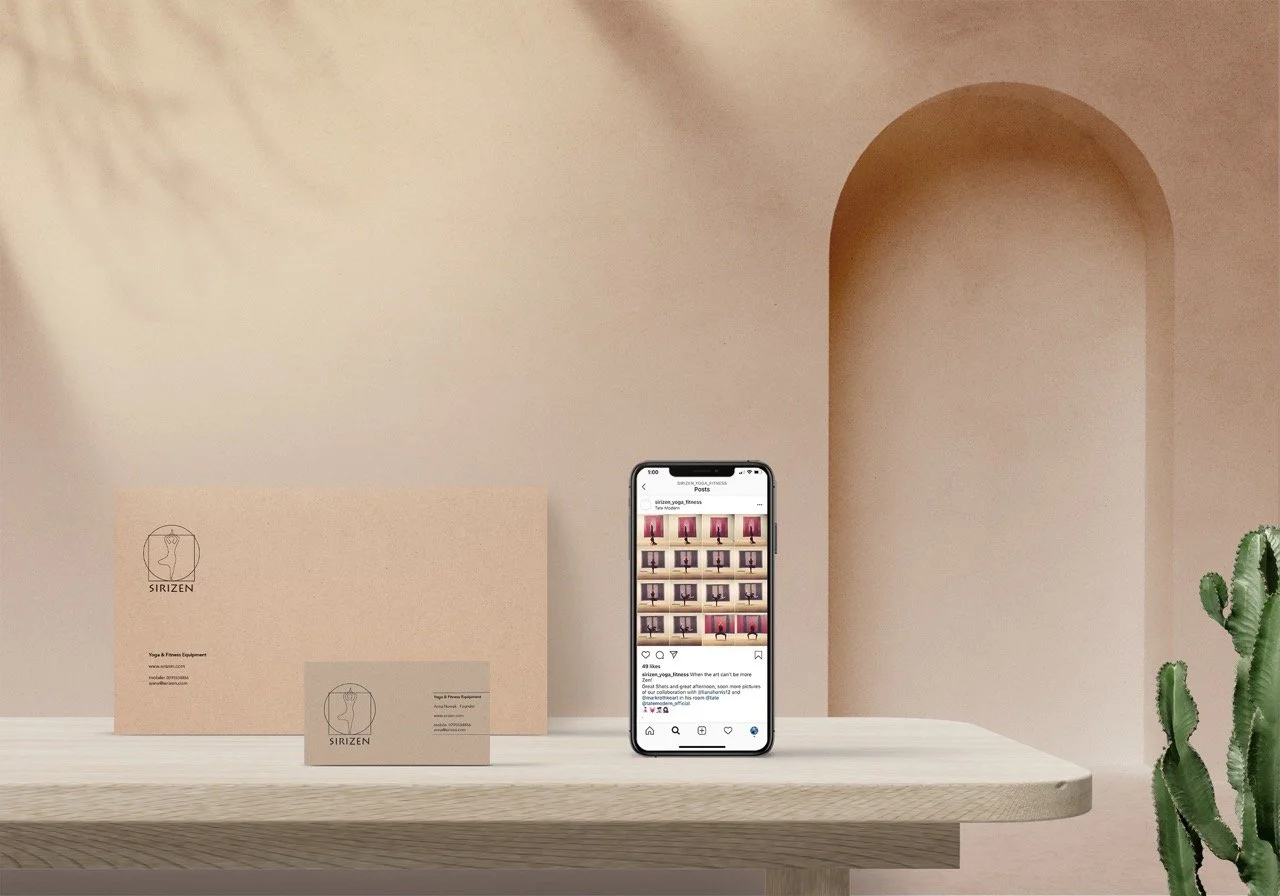
WordPress to Squarespace Migration
The existing WordPress site created more problems than it solved—complex maintenance, security concerns, limited flexibility for the planned course integration. Migrating to Squarespace provided the stability and native tools needed for membership and course delivery.
Migration wasn't simply transferring content; it was restructuring the entire site architecture around clearer user journeys and conversion pathways. Service pages, about content, and initial positioning all received strategic refinement during the rebuild.
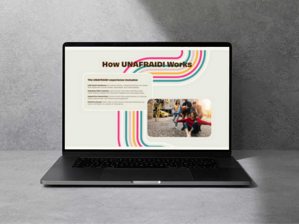
Course Platform Development: Structure and Substance
The core deliverable was a 30-lesson course organised across 6 modules, teaching brain health strategies for managing anxiety. Each module required:
Video lesson pages with embedded content
Downloadable PDF worksheets and summaries
Book recommendations with Amazon affiliate integration
Progress tracking and module gating
Mobile-responsive viewing experience
I built this using Squarespace's member area functionality, creating a structured learning pathway where modules unlocked progressively as students completed previous sections.
Member Area Architecture
The member area needed to support different user experiences based on purchase tier. I created:
Tier 1: Access to all 30 video lessons and downloadable materials
Tier 2: Video access plus private community integration
Multiple paywalls restricting content based on membership level
Clear navigation helping students orient within the course structure
Progress indicators showing completion status
This required careful Squarespace configuration, ensuring the membership logic worked correctly whilst maintaining intuitive navigation.
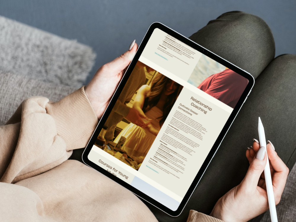
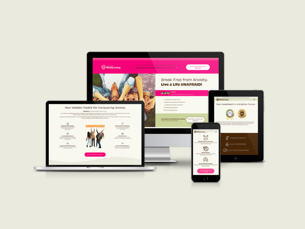
Landing Page Creation
Two major landing pages required development: one for the overall course launch, another for specific promotional campaigns. These pages needed:
Compelling copywriting balancing benefit-focused messaging with credibility signals
Clear value propositions and course module previews
Social proof through testimonials
Strategic CTAs guiding towards purchase or email signup
Mobile-responsive design maintaining conversion focus across devices
Email Marketing Integration
Flodesk integration enabled email capture and campaign delivery. I connected forms across the website and landing pages, ensuring smooth subscriber management and segmentation based on interest level and purchase status.
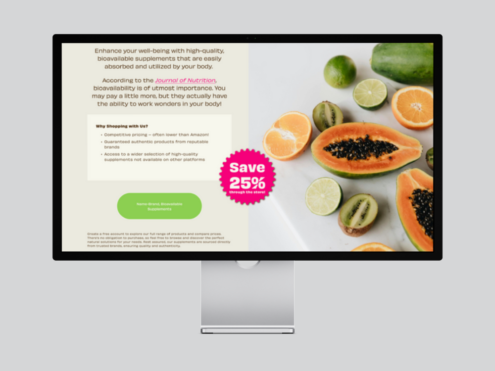
Amazon Affiliate Integration
Course content recommended specific books for deeper learning. I integrated Amazon affiliate links, allowing monetisation of these recommendations whilst providing students with direct purchase access.
Key Features:
- Mobile Optimisation
- SEO Optimisation
- Logo Design
- Website
- Brand Identity
- Custom CSS
- Image Galleries
- Visual Identity
- Contact Forms
- Portfolio Showcase
- Booking System
- Course Platform
- Product Photography
- FAQ Section
- Squarespace Courses
- Membership Site
- Testimonials
- Print Design
- Website Design
- Calendar Scheduling
The Outcome
The platform launched with complete brand identity, professional website, and fully functional course delivery system. Students could purchase access, navigate through 30 lessons across 6 modules, download supporting materials, and engage with content through a structured learning experience.
While the business ultimately pivoted direction (as startups often do), the digital foundation provided everything needed for course delivery and student management. The project demonstrated how comprehensive platform development requires balancing brand design, technical infrastructure, content organisation, and user experience across multiple interconnected systems.
❝ I’ve worked with Anna … and am blown away by her ability to translate business strategy in to beautiful visuals.
As a business strategist myself, what matters even more to me is that she’s a solid sounding board for my ideas and can help me identify holes in a user experience, because she’s worked all parts of it previously.
A beautiful logo and web page are great, but a competent thought partner is priceless! ❞
— Sarah Voltmann, CFWL Business Strategist, Founder/CEO, The Tarsus Project
How Projects Like This Come TogetherWhat to Expect
Every project follows a collaborative process designed for clarity, partnership, and results you'll love.

Discovery & Strategy
Week 1
We start with conversation—understanding your business, audience, and goals. This shapes everything that follows.
What You Get: Clear project timeline, strategic direction, content plan

Design & Development
Week 1-2
I build your project on a staging site where you can follow progress. You'll receive a complete first draft with a video walkthrough explaining every design decision.
What You Get: Staging access, video walkthrough, feedback opportunities

Review & Refinement
Week 2-3
Your feedback shapes the final result. We discuss changes, I implement revisions, and we polish every detail until you're thrilled.
What You Get: Revisions, direct communication, collaborative problem-solving

Training & Handover
Week 3
Your project goes live! You receive comprehensive training (live session + recorded videos), all credentials, and 30 days of support.
What You Get: Platform training, video tutorials, 30 days support, full ownership
Typical Timeline: 2-6 weeks for standard website projects, depending on complexity
Expedited Delivery: Available for time-sensitive projects
Complex Projects: Timeline adapts to your specific needs
Let's Talk About Your Project
Let's start with a conversation.
No pressure, no sales pitch—just an honest discussion about what you need and whether I'm the right fit to help.
Book a Discovery Call
Tell me about your vision and what you're hoping to achieve. We'll talk through your goals, I'll explain how I work, and we'll both know if this is the right partnership. The call is free—no obligation, just conversation.
Or explore more options:
Send a Message → Get in touch via contact form
View All Portfolio → See more examples of our work
Learn About Services → Understand what's included
Read Client Reviews → Hear what others say
See other work in this space:
A decade of precision millwork with no web presence. Dual-brand Squarespace build, logo refresh, and a story worth telling — built to match the work.