
Wise Planning, Strategic Advantage: Brand Strategy & Squarespace Design for SovaTech Consulting
Architecture & ConstructionSovaTech Consulting: Brand Identity & Website
Client: Lee Jones, Founder, SovaTech Consulting
Project Type: Brand Strategy + Complete Visual Identity + Custom Squarespace Website
Duration: one week
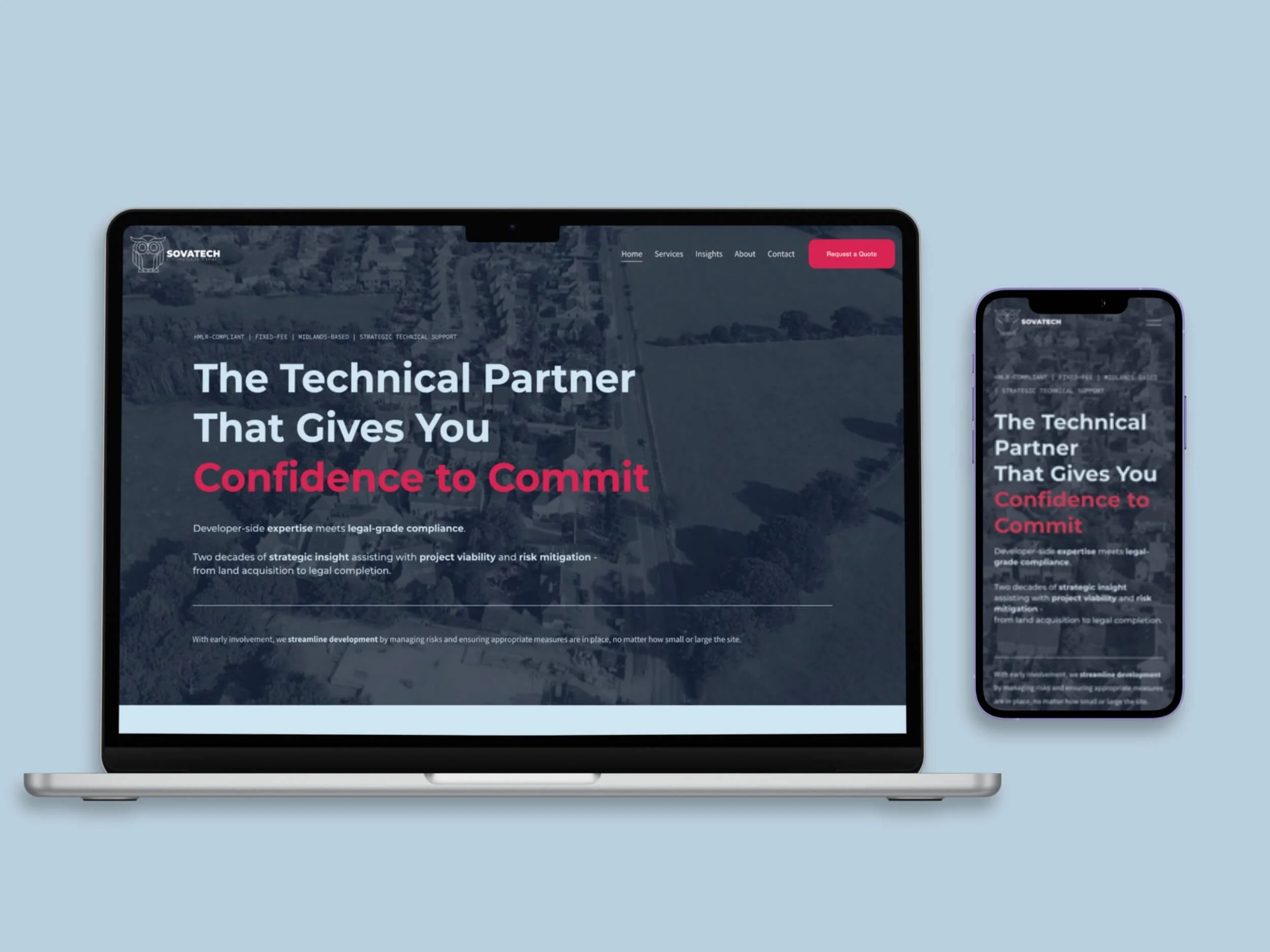
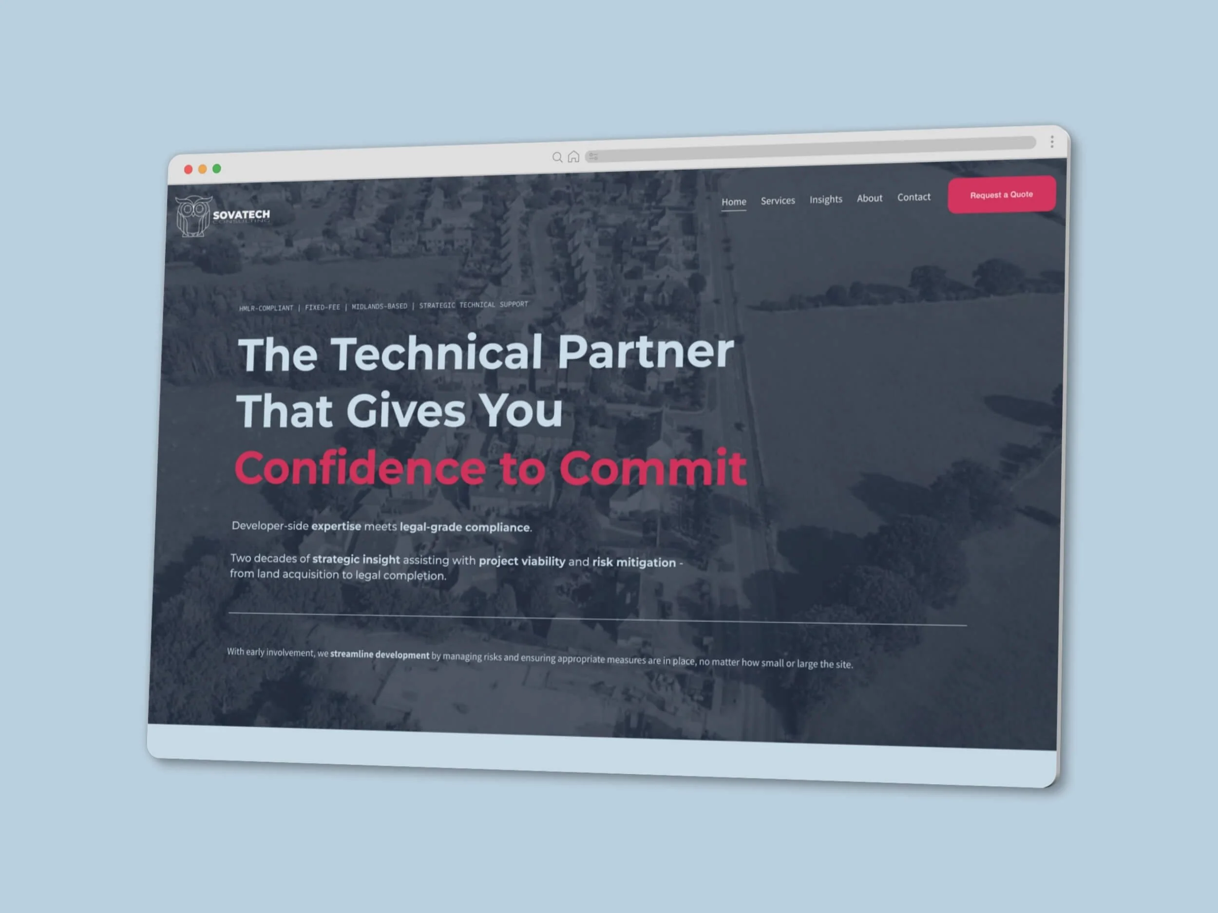
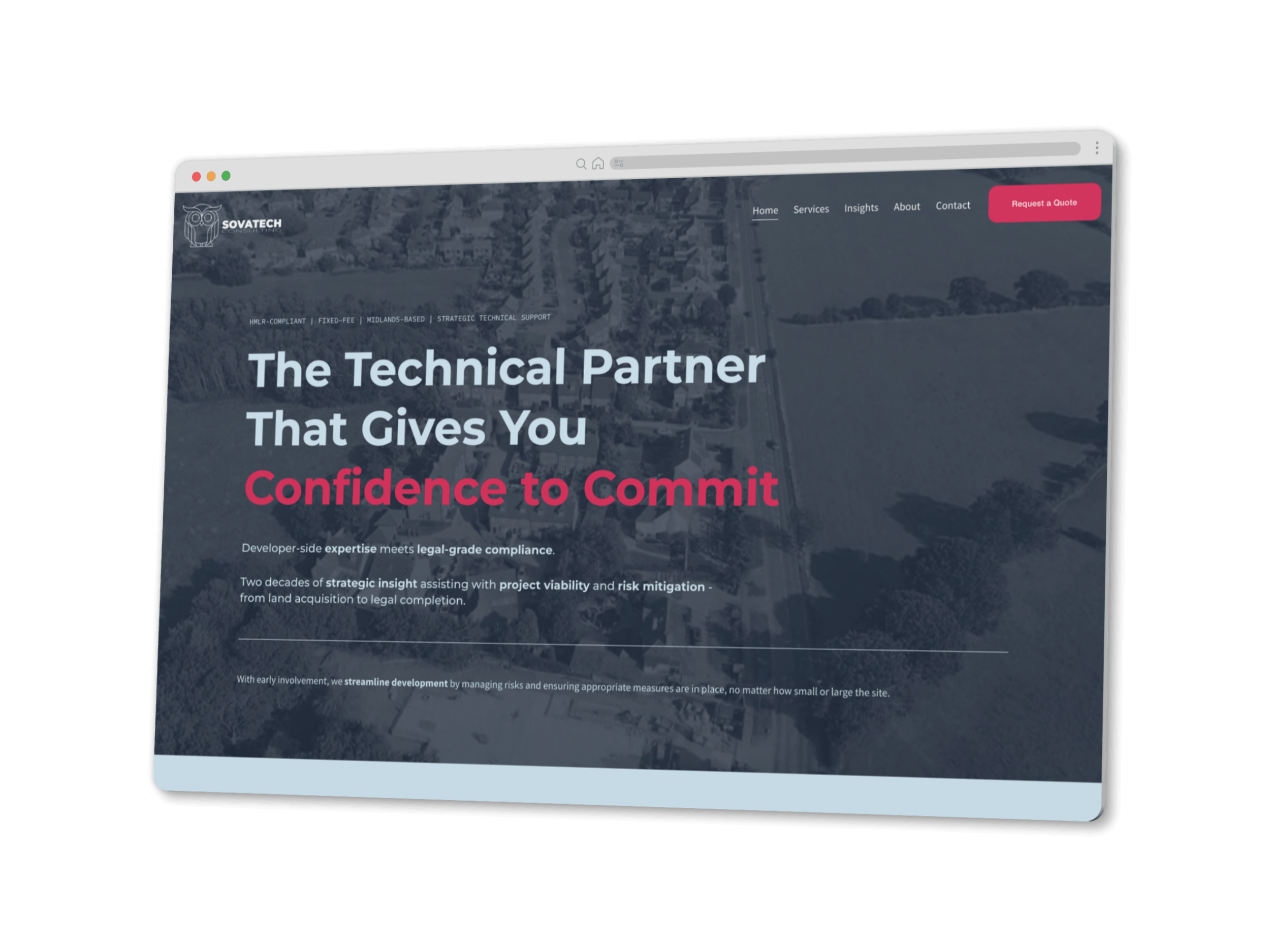
SovaTech Consulting needed to launch into a sector that trusts precision over polish — and to speak credibly to two very different audiences at once. The work started with positioning and audience research, moved through a full visual identity, and ended in a Squarespace site that splits the journey early and turns dense technical content into something people actually read.
The Challenge
A new consultancy with two decades of sector expertise behind it — and nothing visual to carry it. No brand, no site, no way to be found.
Two problems sat underneath that. First, the audience isn't one audience. Developers and housebuilders arrive asking whether this consultancy can de-risk a site before they commit capital. Legal and conveyancing teams arrive asking whether the documentation will survive scrutiny. Same expertise, completely different anxieties, completely different vocabulary.
Second, this is a sector where restraint signals competence. Anything decorative reads as inexperience. But the content is genuinely dense — technical, compliance-led, detail-heavy — and dense content that looks dense doesn't get read.
Strategic Foundation: Research Before Design
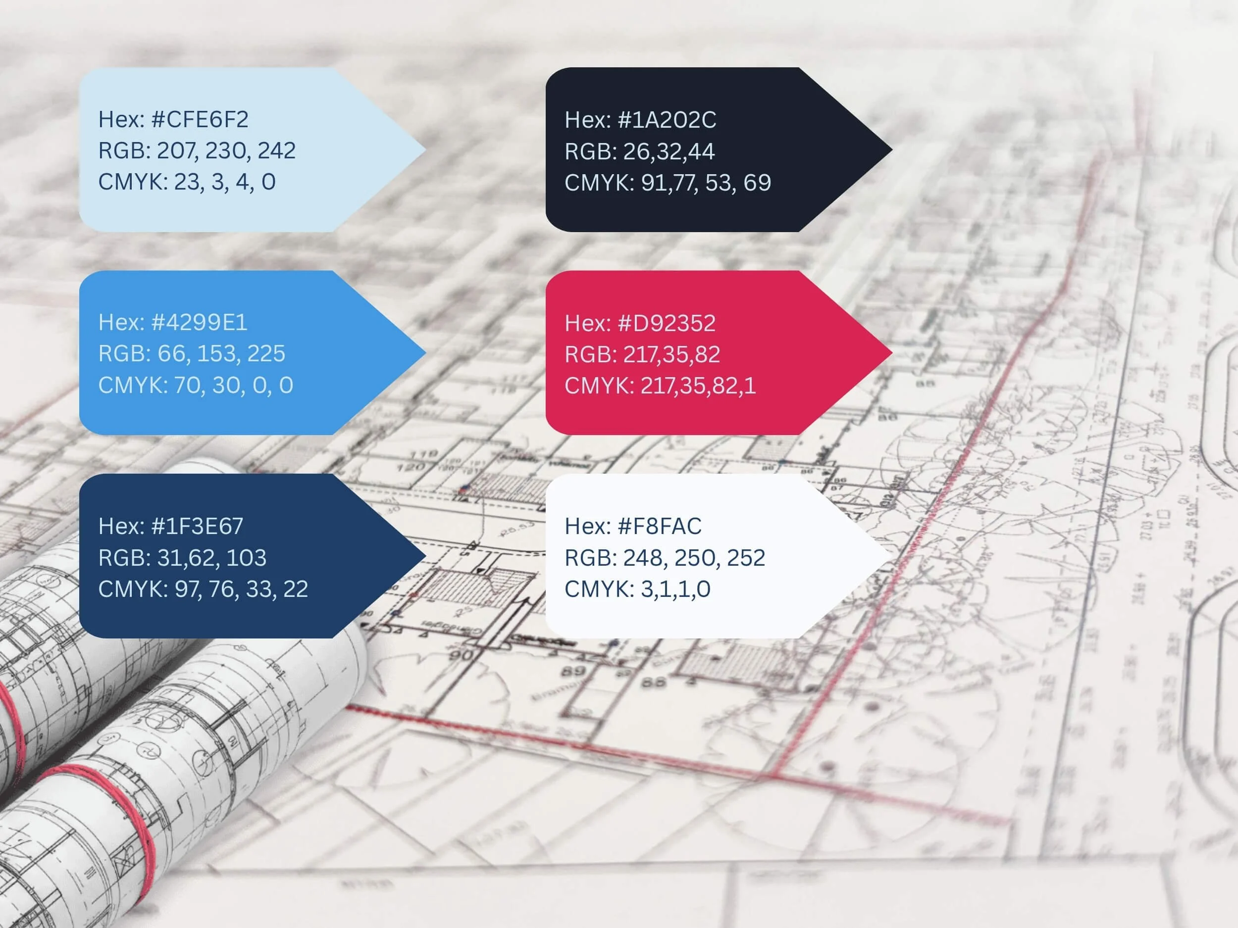
Nothing was drawn until the positioning was settled. That meant mapping both audiences properly — what each one is actually worried about, what language they use, what evidence moves them, and where in their own process they go looking for someone like SovaTech. It also meant reviewing how comparable consultancies present themselves, and identifying where the visual conventions of the sector could be met without disappearing into them.
The output was a positioning line — wise planning, strategic advantage — and a clear decision that the site would separate the two audiences rather than average them. Every design and copy decision after that traces back to this stage.
“Anna got this immediately. She spent real time understanding how we talk about our work before a single page was built.”
Identity: Building the Brand From the Name
The name gave us the mark. Sova is Polish for owl — so the owl was already in the business, it just hadn't been drawn yet. It carries exactly the associations the sector responds to: wisdom, vigilance, knowledge, safety.
The detail that makes it work is in the eyes. Rather than plain circles, they're built as crosshair registration marks — the setting-out and survey notation the audience sees every working day. It reads as an owl from a distance and as a technical drawing up close.
I delivered a set of lockups: a linear monochrome version doing the heavy lifting across the site and formal channels, and a fuller-colour owl for social platforms where the tone loosens.
A Palette Borrowed From the Drawing Board
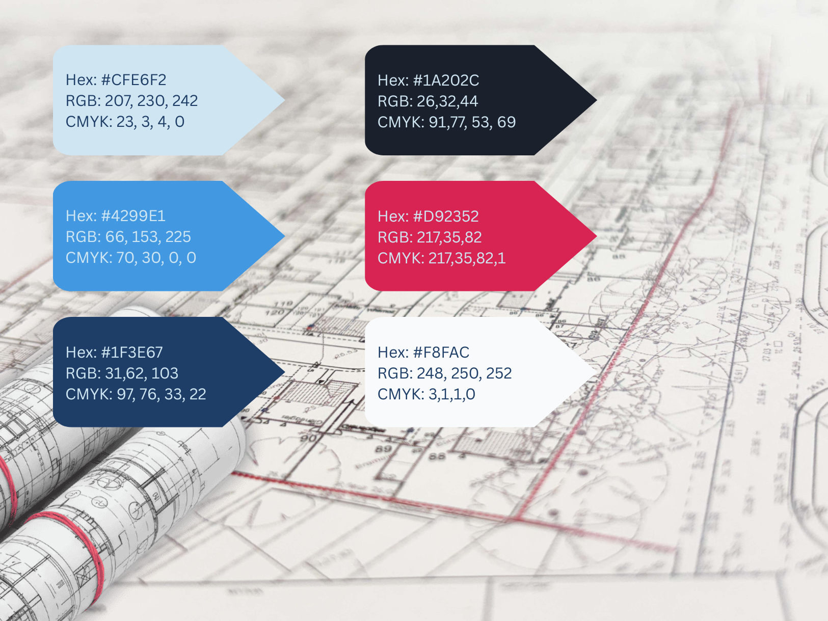
The red came from red-line drawings — the notation surveyors and architects have used forever. It's used sparingly and deliberately, always to signal what matters most: emphasis in headings, primary buttons, key figures.
The blues do the structural work. Deep navy for authority and depth, a mid blue for interaction and secondary actions, and a pale blue that softens the whole thing and stops it tipping into cold corporate. The near-black anchors dark sections; the off-white keeps drawing-led imagery clean and legible.
Modest, on purpose. This palette earns trust rather than asking for attention.
Key Features:
- Blog Setup
- Brand Identity
- Brand Strategy
- Calendar Booking Integration
- Contact Forms
- Custom CSS
- E-commerce
- Lead Capture
- Logo Design
- Minimal Style
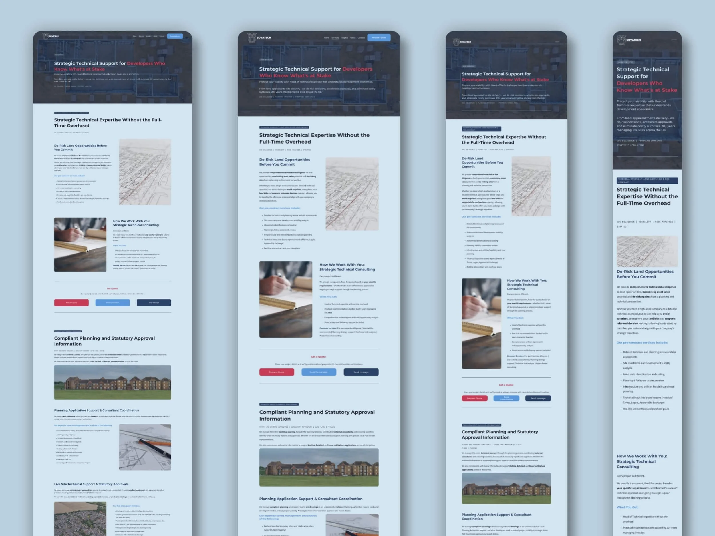
- Mobile Optimisation
- Organic Style
- Payment Processing
- Playful Style
- Positioning
- SEO Optimisation
- Target Audience Definition
- Third Party Integration
- Visual Identity
- Website Build
Typography and the Editorial-Technical Register
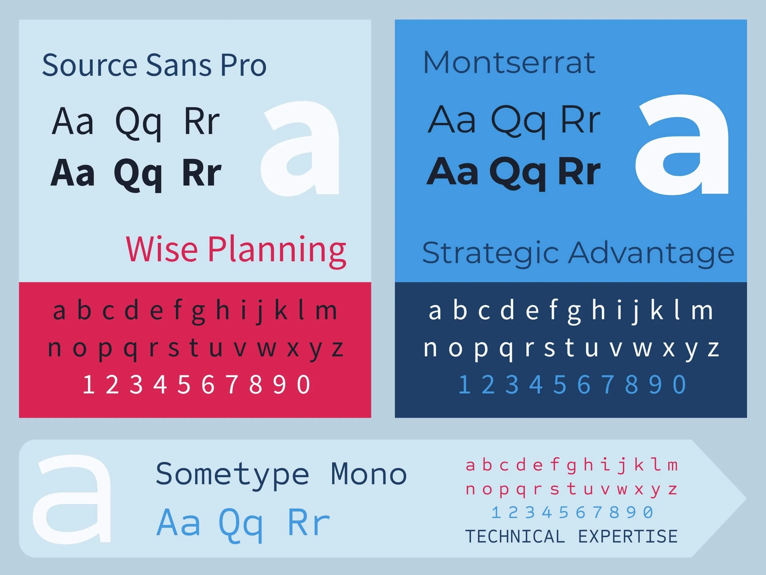
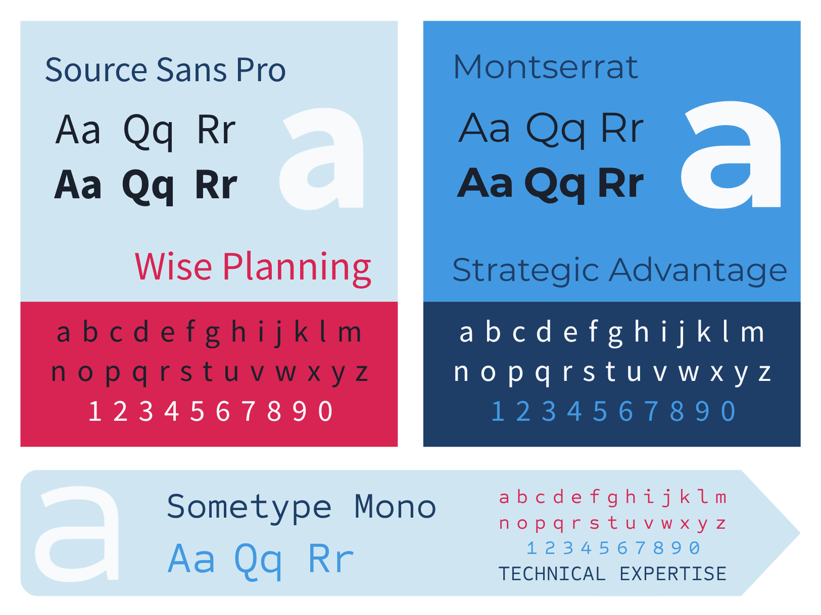
Montserrat for headings — confident, geometric, structural. Source Sans Pro for body copy, chosen for stamina across long technical passages.
The third face is the one doing the quiet magic: Sometype Mono, used for eyelash headings, section labels and micro-detail throughout. It's a small move with an outsized effect — it gives every section the register of a drawing annotation, and pulls the whole build toward an editorial-technical aesthetic rather than a generic corporate one. Restrained palette, wide-tracked mono labels, generous white space, strong horizontal rules.
Two Audiences, Two Journeys
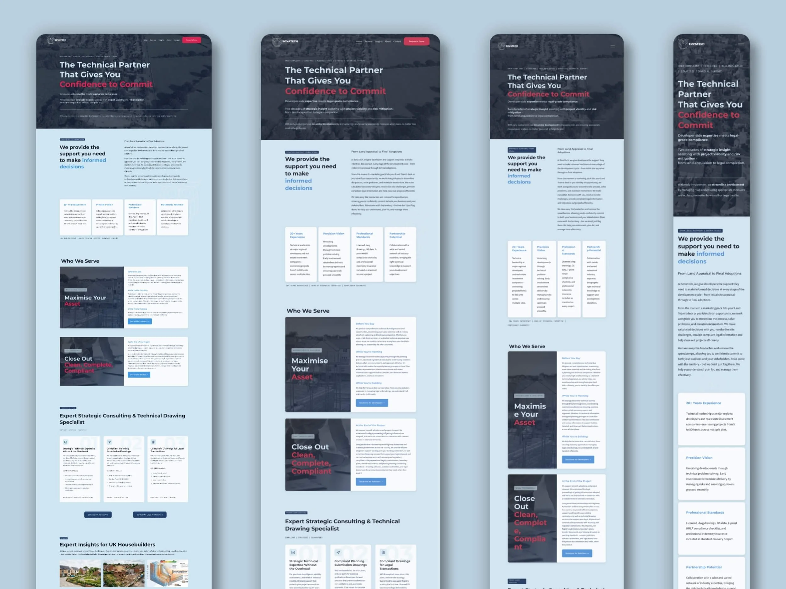
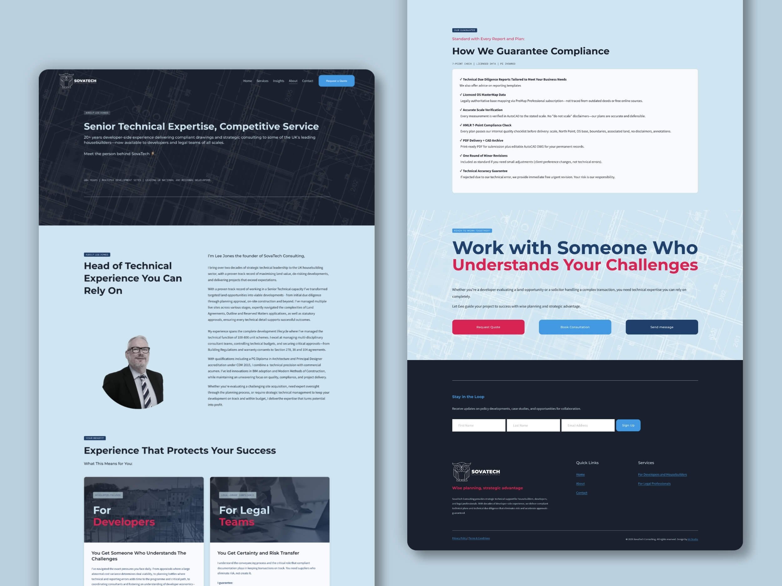
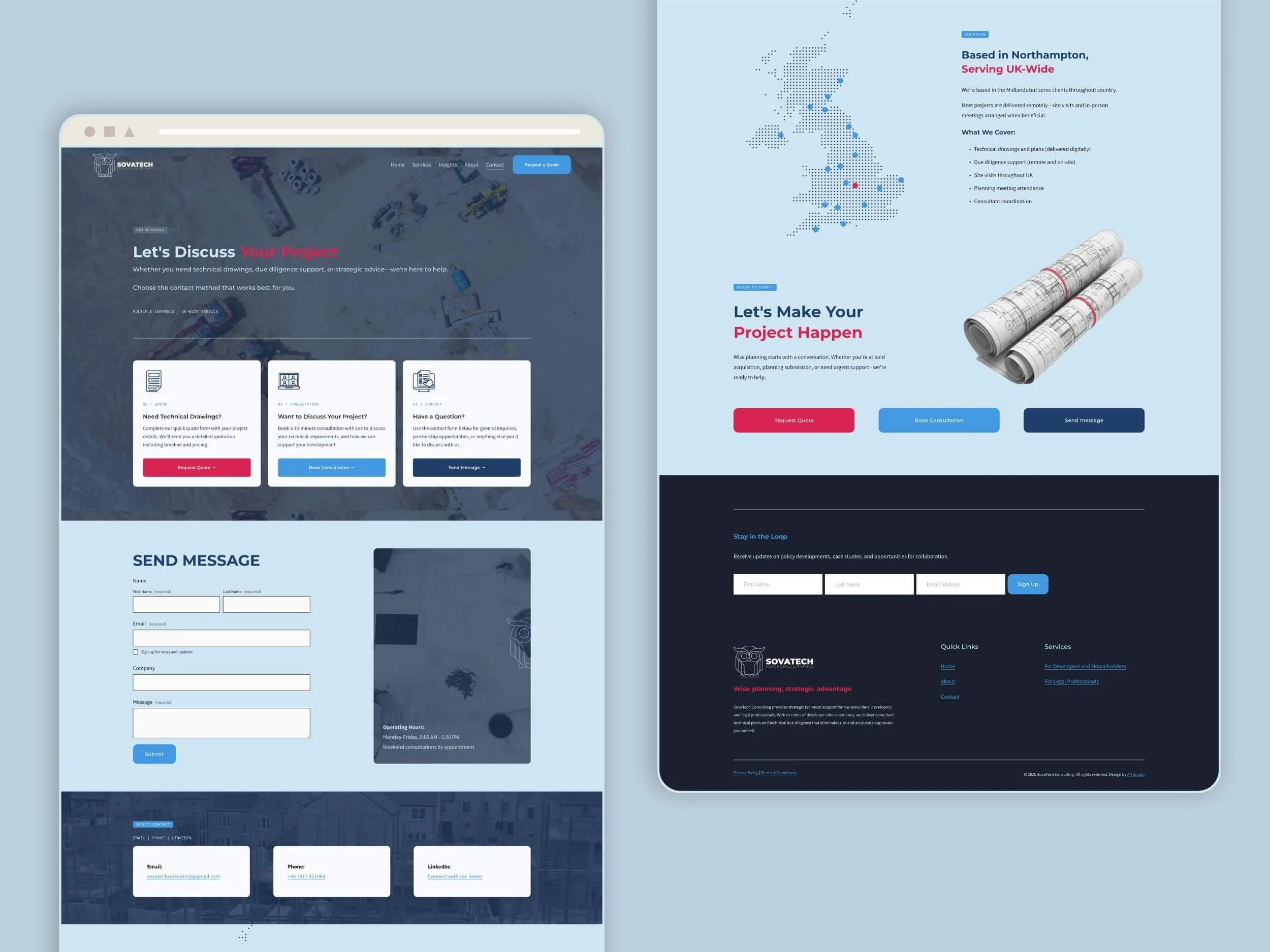
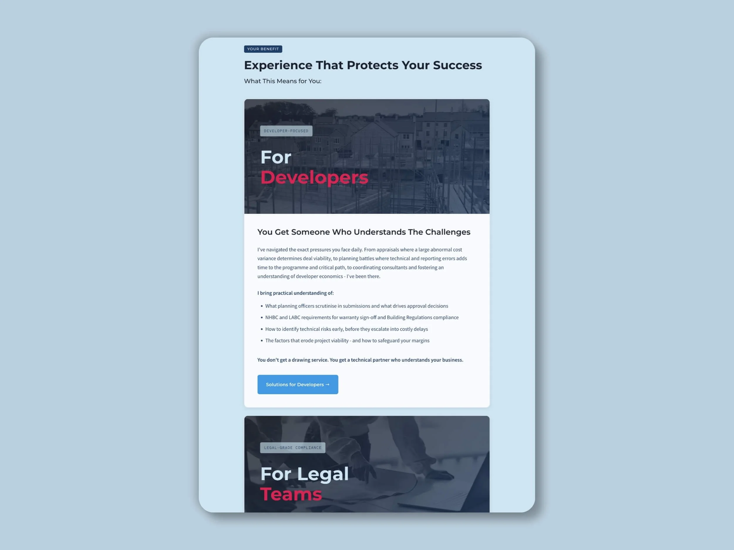
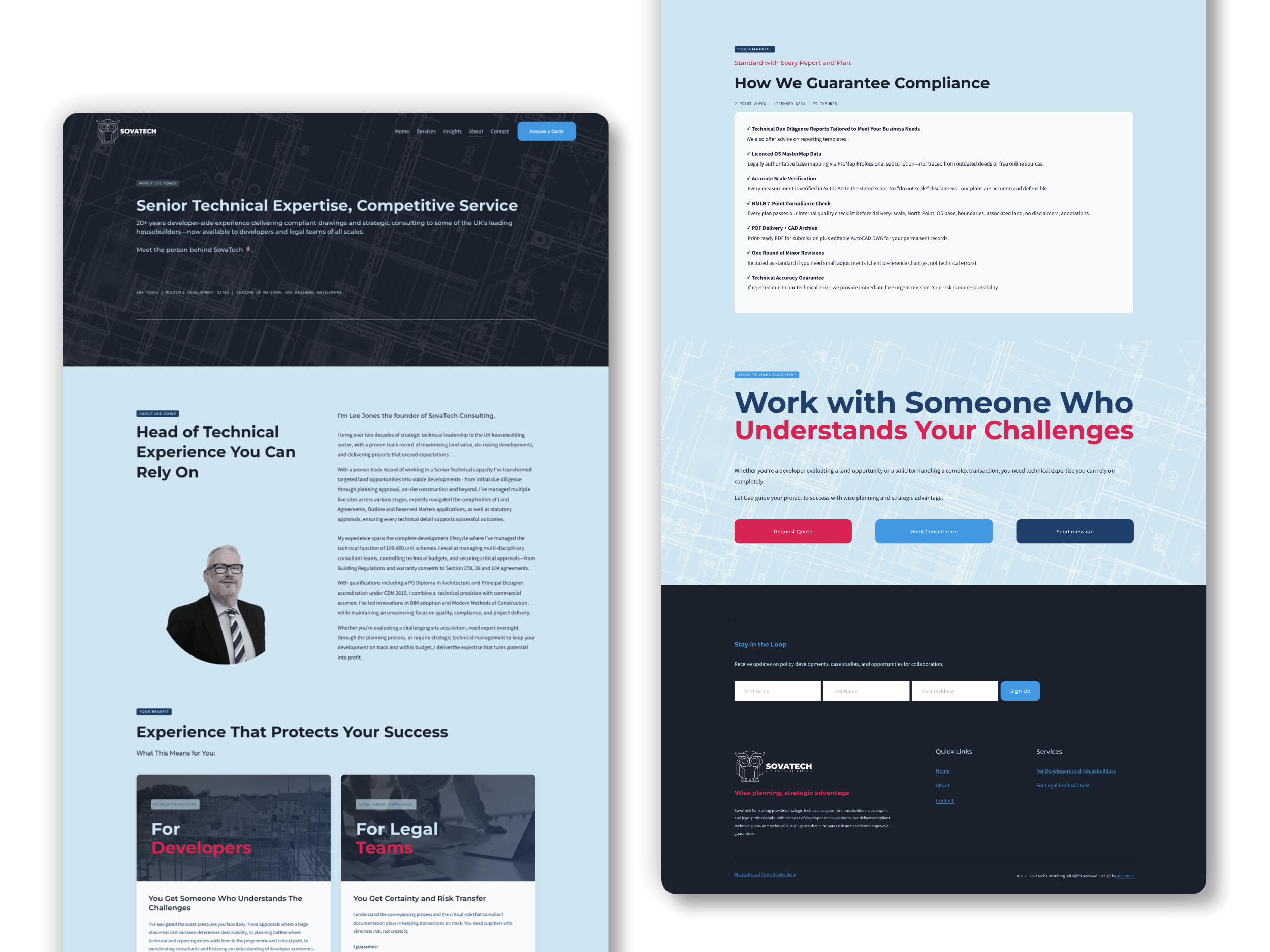
The split starts on the homepage, where visitors self-select rather than being asked to. From there, each audience has a dedicated landing page built around their own language, risks and proof points. Both routes converge on the same conversion moment — a quote request or a consultation booking.
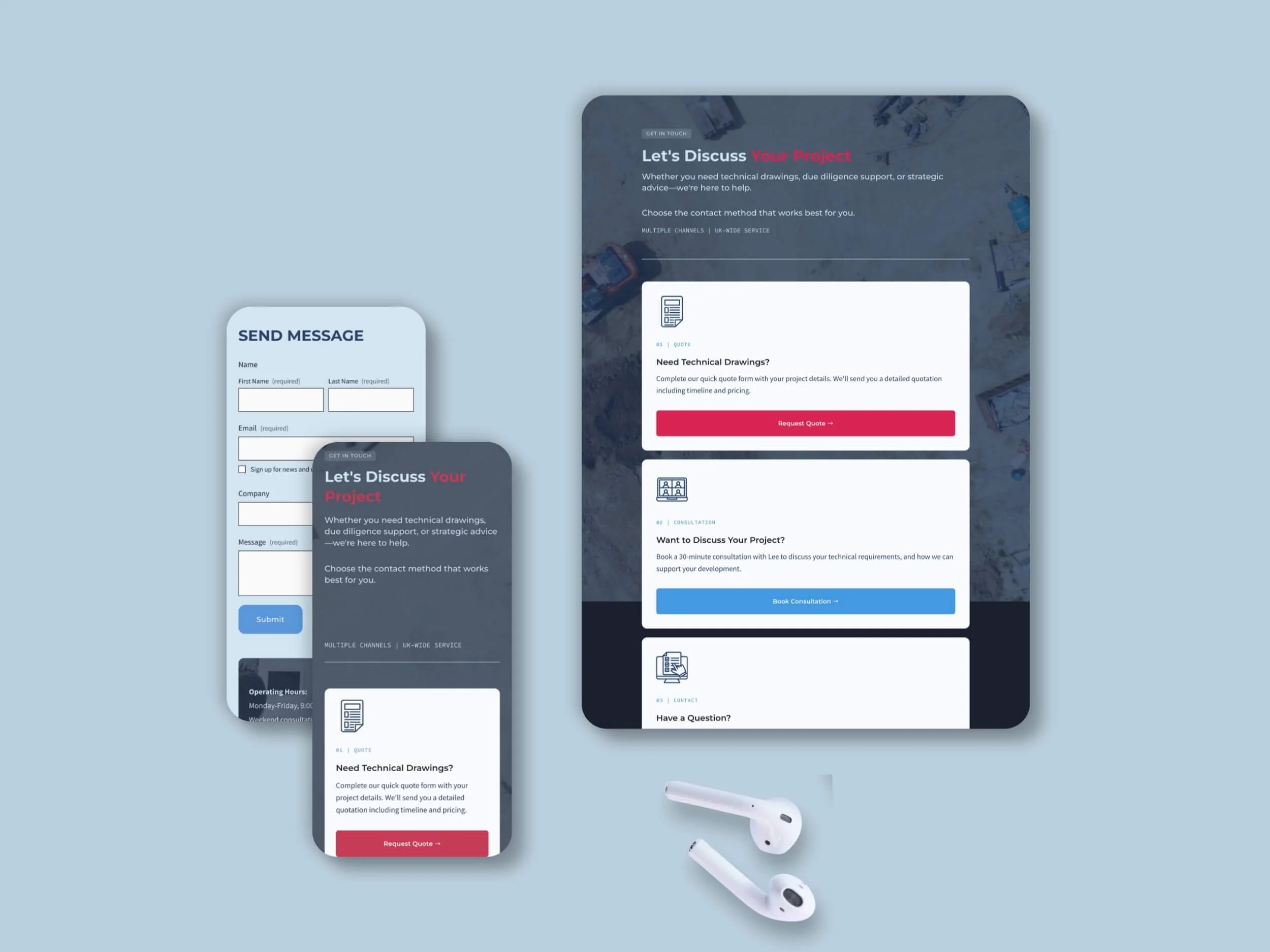
Around that core: an About page built to establish individual credibility, a Contact page offering three distinct routes in, and an Insights section for regulatory updates and sector commentary — the long-term SEO engine.
Making Dense Content Readable
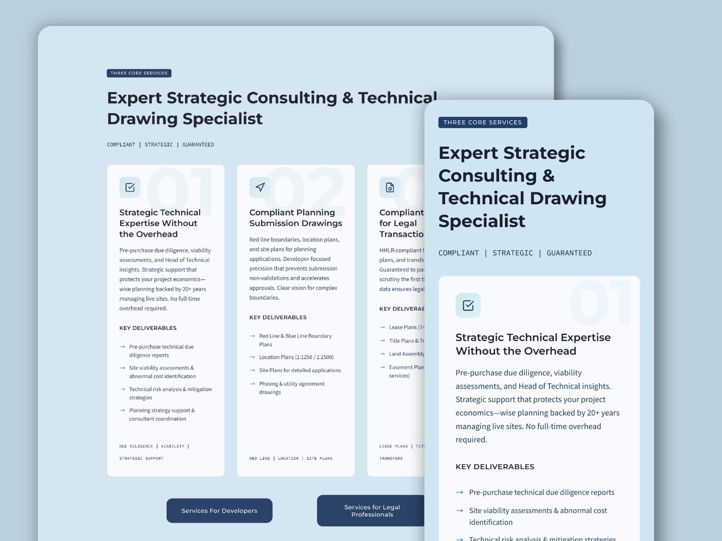
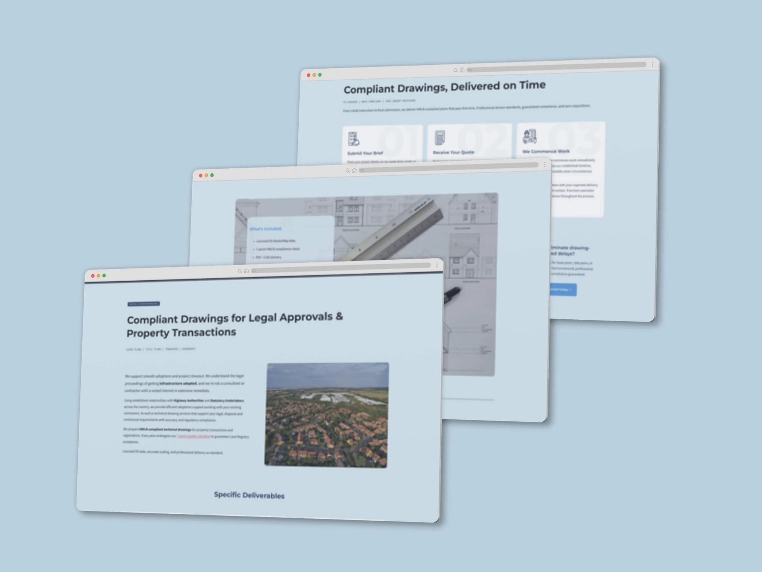
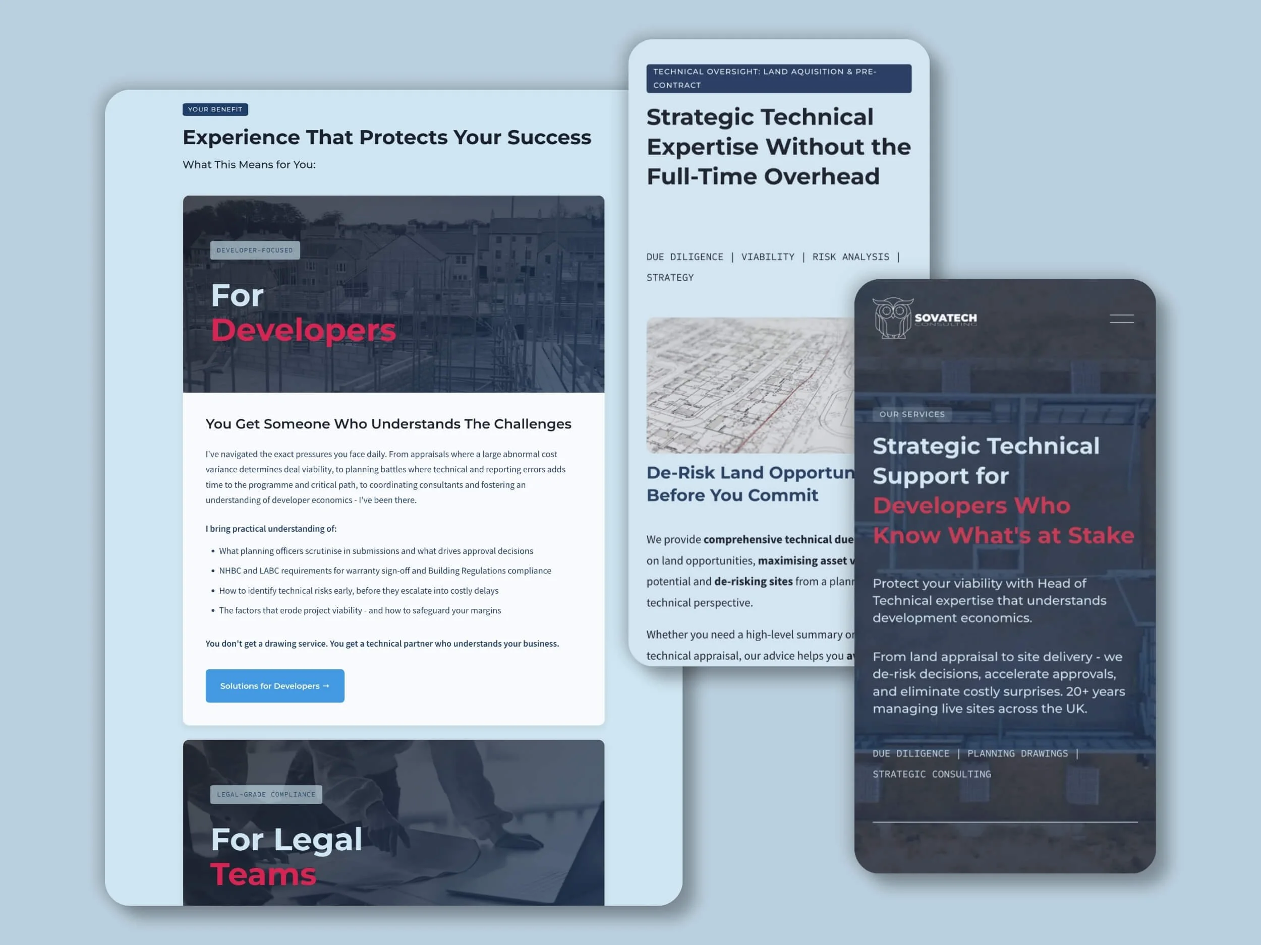
This was the real design problem. The solution was structural rather than decorative: modular card blocks that break technical detail into digestible units, numbered process sequences with oversized ghost numerals, alternating light and dark bands to pace the scroll, restrained entry animation, and imagery used as deliberate breathing space between text-heavy sections.
Build & Delivery
Built in Squarespace with custom CSS and HTML throughout — the mono typography system, card layouts, section styling and interaction states are all coded rather than templated. Custom graphic work included blueprint-style background treatments, a bespoke UK coverage map on the Contact page, and a set of line icons for the compliance guarantees. Tally handles the quote form, keeping a detailed enquiry flow off the page until the visitor is ready for it. Newsletter capture, blog architecture and full mobile optimisation completed the build, with SEO structured in from the first wireframe rather than added at the end.
❝
When we came to Anna at AH Studio, we knew exactly what we didn't want: a bolt-on Squarespace template that looked like every other consultancy site out there. What we needed was proper property and planning consultancy web design — something that reflected the technical depth of our work with housebuilders and developers, while still feeling approachable to clients coming to us for land and planning advice.
Anna got this immediately. She spent real time understanding how we talk about our work before a single page was built, which meant the brand strategy and UX design decisions actually made sense for our audience rather than following a generic playbook. The result is a site with proper architectural and built environment branding — confident, clean, and unmistakably ours.
On the technical side, the custom Squarespace development was seamless. The site loads fast, works beautifully on mobile, and was built to be SEO-optimised from the ground up, which we're already seeing the benefit of in enquiries. If you're a technical consultancy, housebuilder or land and planning specialist looking for a website that actually understands your world, Anna and AH Studio are the people to call.
❞
— Lee Jones, Founder, SovaTech Consulting
How Projects Like This Come TogetherWhat to Expect
Every project follows a collaborative process designed for clarity, partnership, and results you'll love.

Discovery & Strategy
Week 1
We start with conversation—understanding your business, audience, and goals. This shapes everything that follows.
What You Get: Clear project timeline, strategic direction, content plan

Design & Development
Week 1-2
I build your project on a staging site where you can follow progress. You'll receive a complete first draft with a video walkthrough explaining every design decision.
What You Get: Staging access, video walkthrough, feedback opportunities

Review & Refinement
Week 2-3
Your feedback shapes the final result. We discuss changes, I implement revisions, and we polish every detail until you're thrilled.
What You Get: Revisions, direct communication, collaborative problem-solving

Training & Handover
Week 3
Your project goes live! You receive comprehensive training (live session + recorded videos), all credentials, and 30 days of support.
What You Get: Platform training, video tutorials, 30 days support, full ownership
Typical Timeline: 2-6 weeks for standard website projects, depending on complexity
Expedited Delivery: Available for time-sensitive projects
Complex Projects: Timeline adapts to your specific needs
Let's Talk About Your Project
Let's start with a conversation.
No pressure, no sales pitch—just an honest discussion about what you need and whether I'm the right fit to help.
Book a Discovery Call
Tell me about your vision and what you're hoping to achieve. We'll talk through your goals, I'll explain how I work, and we'll both know if this is the right partnership. The call is free—no obligation, just conversation.
Or explore more options:
Send a Message → Get in touch via contact form
View All Portfolio → See more examples of our work
Learn About Services → Understand what's included
Read Client Reviews → Hear what others say
See other work in this space:

York's only dedicated wheel-throwing studio was selling courses, taster sessions, private events and memberships entirely by email. Now the website does it.