
Clay Space York: The Website That Runs a Pottery Studio
Creative & Arts · Education & Training · ExperiencesClay Space York — Squarespace Website & Acuity Booking System
Client: Angela Collinson, Founder, Clay Space York
Project Type: Squarespace Website Build + Full Acuity Scheduling Booking System
Duration: Core website + scheduling system - 4 weeks. Ongoing Project.
Live Website: https://clayspaceyork.com
Clay Space York is the only studio in York dedicated entirely to the potter's wheel. It sells four different things — taster evenings, multi-week courses, private events and a members' studio. Before this project, every single one of them was booked by email.
Clay Space York is the only studio in York dedicated entirely to the potter's wheel. Ten wheels, seven-day member access, taught by working ceramicists.
It sells four different things. Taster evenings for people who fancy a nice night out. Three, six and nine-week courses for people who want to actually learn. Private events for hen parties and corporate groups. And a members' studio for potters who already know what they're doing.
Before this project, every single one of those was booked by email.
The problem wasn't the website. It was the inbox.
Angela already ran Bish Bash Pot, a pottery painting studio in York. Clay Space grew out of it — a quieter, wheel-focused making studio in the same building. Two genuinely different businesses sharing one website, one booking process and one payment account.
So enquiries all landed in the same place, and every one of them started a conversation.
Someone asks when the next beginners' course starts. Reply with dates. They ask whether their friend can come too. Reply again. They ask how to pay. Reply again. Then someone has to remember to check there's actually a wheel free, write the name down somewhere, and send a reminder nearer the time.
Five or six messages to sell one place on a course. Repeated across every course, every taster, every birthday group, every membership enquiry.
Meanwhile capacity lived in someone's head. Ten wheels means ten people and not one more. Working that out by counting emails is how a studio ends up double-booked — or running a half-empty course because nobody realised the spaces were still there.
Angela's own summary, from one of our first emails: "It's a bit of a nightmare using so many different ones."
So the brief was never "make it look nicer". It was: sell four different things properly, respect the studio's real capacity, and get Angela out of her inbox.
What that admin actually costs
127 bookings a month - The monthly average taken through the system since the studio launched.
Now imagine those had come in by email:
Lets estimate ten minutes each, end to end — read the enquiry, check the diary, reply with dates, reply again, chase payment, write it down, send a reminder.
That's around 21 hours a month.
Roughly five admin hours, every single week.
Not trimmed. Gone — because none of those bookings needed a reply at all.
Five hours a week is most of a working day. That is the argument for a booking system in a single number, and it has nothing to do with convenience.
Before · booked by email
After · booked by the website
127
Bookings a month, taken without a single reply
5 hrs
Of admin a week the old way would have cost
Who is this person, and where are they going?
We started by mapping how people actually arrive at pottery. Four distinct people come to Clay Space, and they want completely different things.
The experience seeker wants a date night, a birthday, something to do with friends. Low commitment, high fun. They're buying an evening, not a skill.
The skill explorer is curious enough to commit to three weeks, and wants to know they can do it before spending more.
The committed student is ready for six or nine weeks. They want depth, technique, progress.
The independent potter already knows how to throw. They want wheels, kiln access, shelf space, and to be left alone.
Sell all four the same way and you lose all four. The hen party organiser does not want to read about firing schedules. The experienced potter does not want to be sold a taster session.
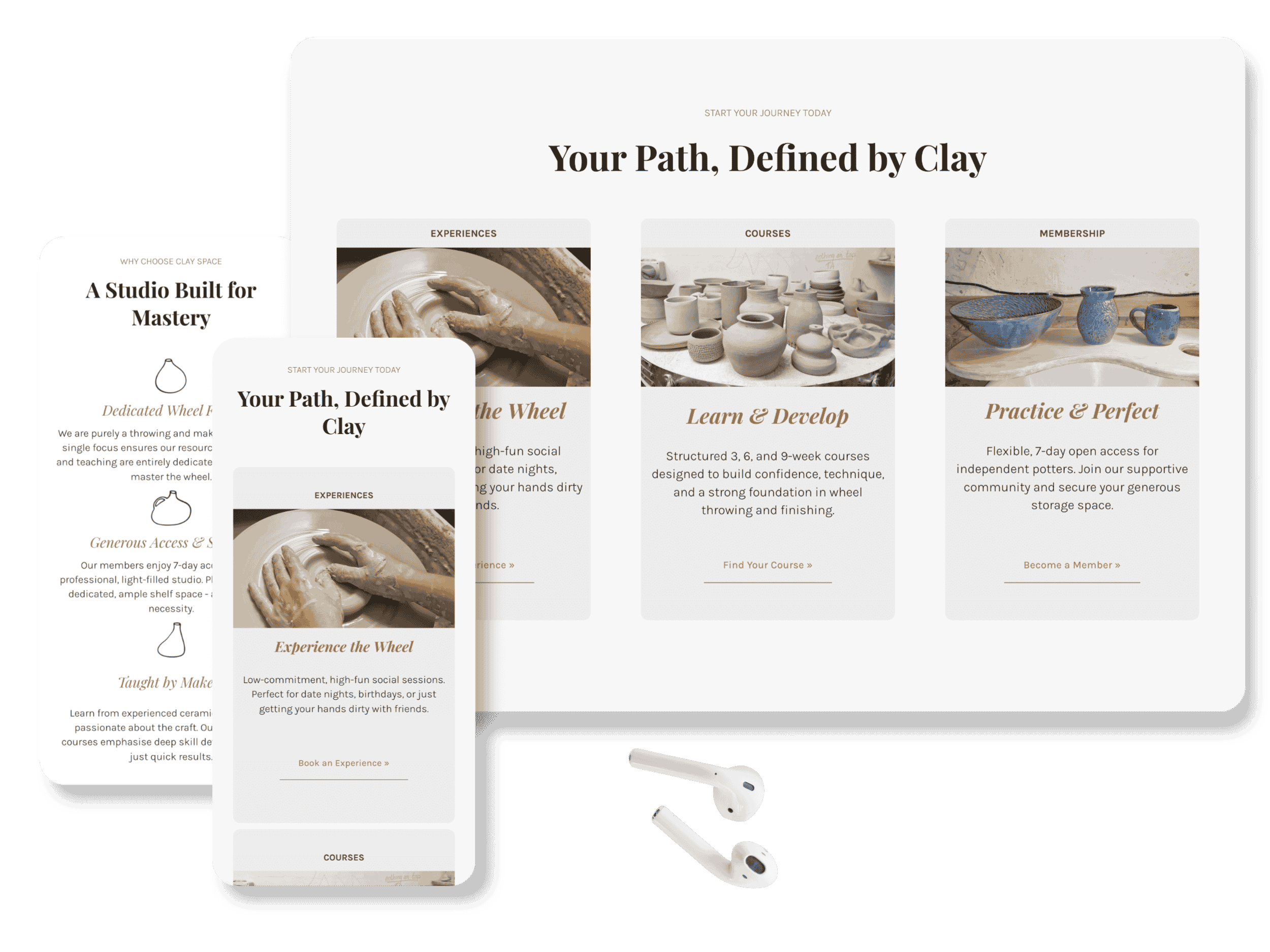
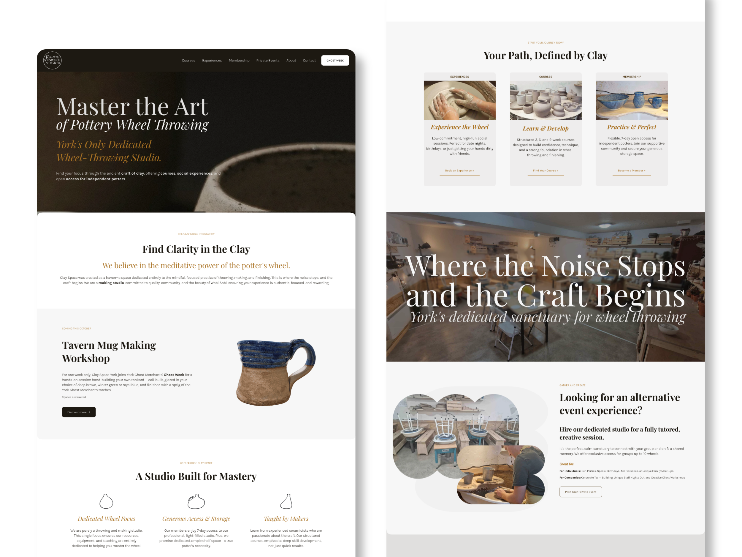
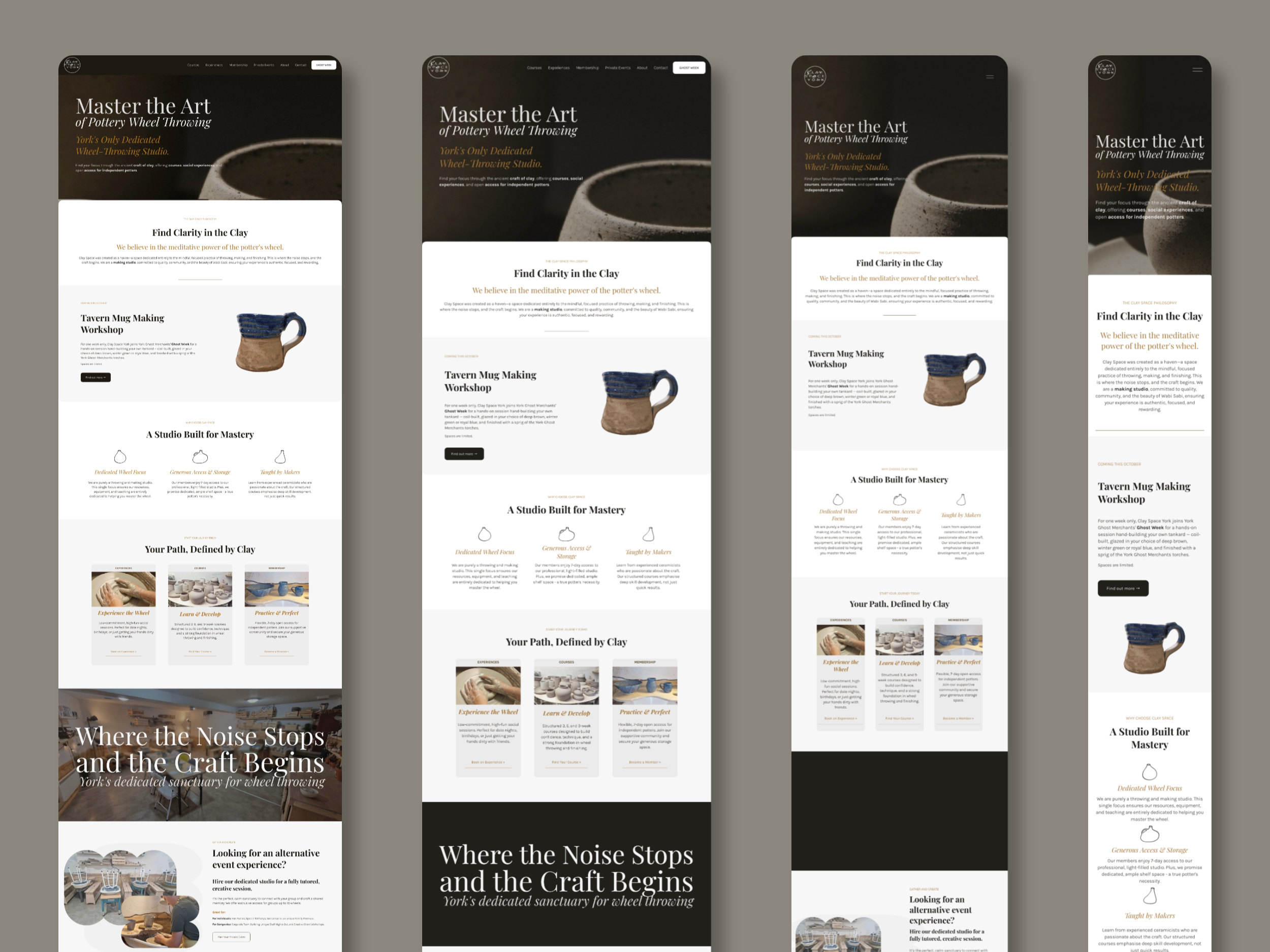
So the homepage does exactly one job: it asks who you are, and sends you somewhere useful. Three routes — Experiences, Courses, Membership — under the heading Your Path, Defined by Clay. Every other decision on the site follows from that one.
Inside the booking system
This is the part of the project I'm proudest of, and the part nobody sees.
The whole studio runs on Acuity Scheduling, configured to do four genuinely different jobs from one system.
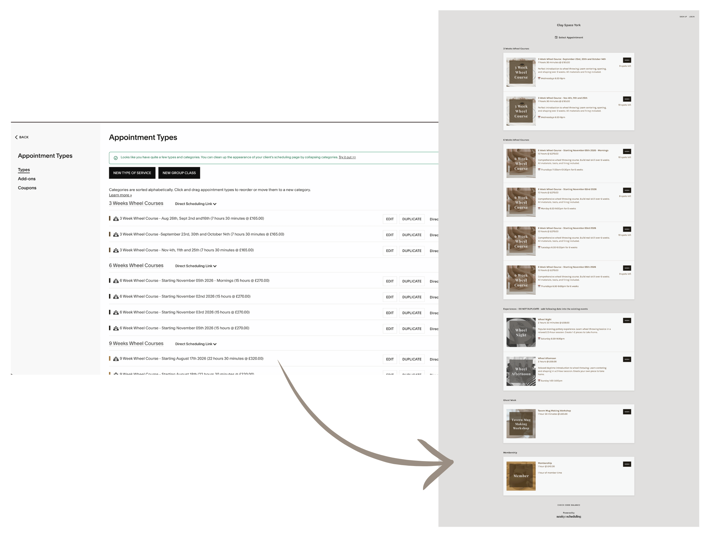
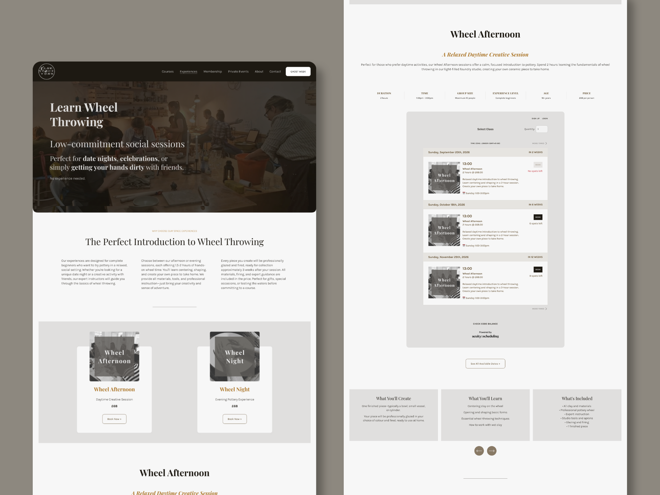
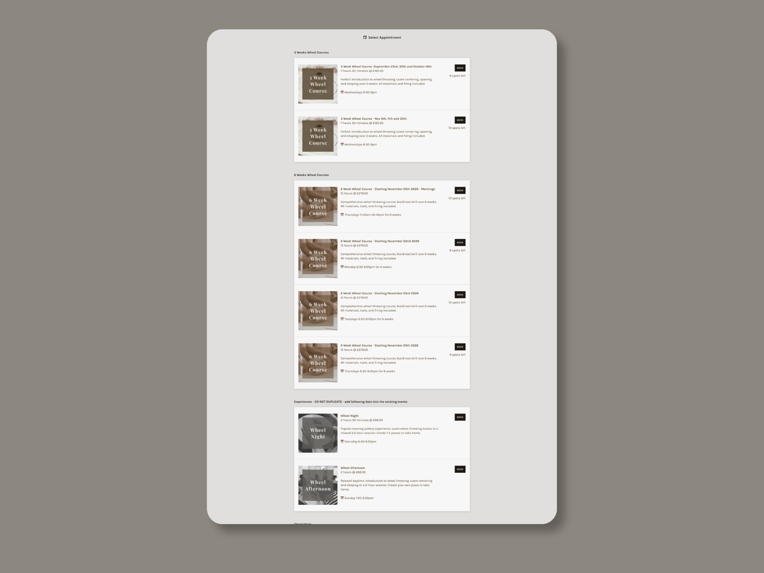
Courses run as class series. A six-week course isn't six bookings — it's one purchase covering six fixed dates. The customer pays once, receives one confirmation listing every session, then gets a reminder before each individual evening. Capacity is set to the number of wheels, so a course physically cannot oversell. When it fills, it shows as full.
The catch — and this is the thing most people miss — is that Acuity has no concept of a "cohort". Every intake needs its own class type. The autumn Monday course, the autumn Tuesday course and the Thursday morning course all exist separately in the system. Which is precisely why the naming convention and category structure had to be right on day one, before anyone else started adding dates to it.
Experiences run as repeating group classes.
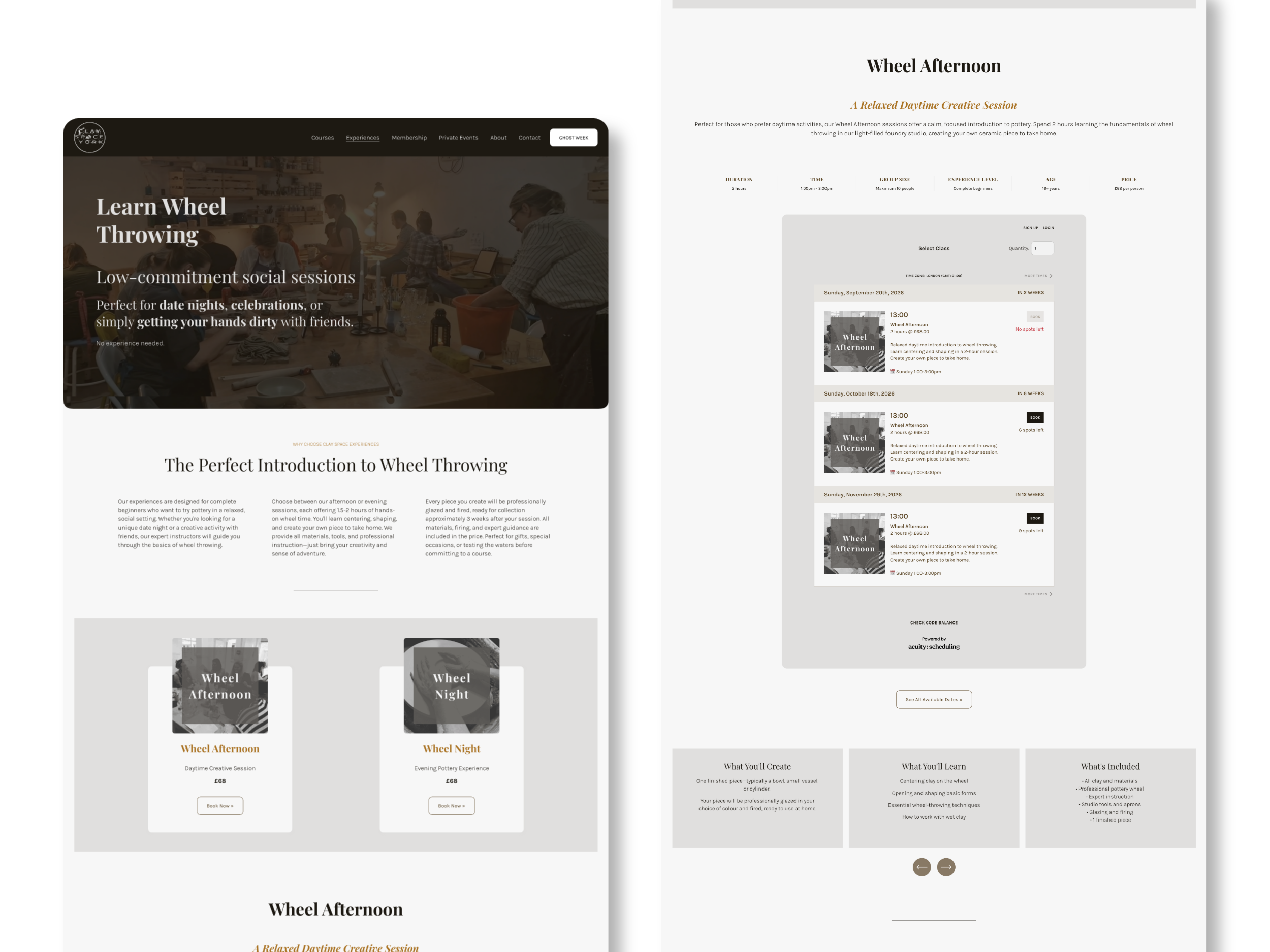
Wheel Night and Wheel Afternoon come round on rotation. Same product, many dates, each with its own capacity. We switched on multiple-spot booking, so one person can book for four friends in a single transaction. Obvious — but it's off by default, and it's the difference between a group booking and four people giving up at the checkout.
Membership runs as a subscription.
Members pay monthly and draw down a set allowance of studio sessions across the month — an hour on a Tuesday, an afternoon at the weekend — rather than having to book it all in one go. That's the part that makes a members' studio work as a product rather than an honour system, and it's a configuration job, not a plug-in.
Private events stay human, deliberately.
Corporate groups and large parties genuinely do need a conversation. So this is the one route that still reaches a person — but it arrives as a structured enquiry with group size, date and occasion already answered, rather than an open-ended email that needs three replies before it means anything.
And the categories became the site architecture.
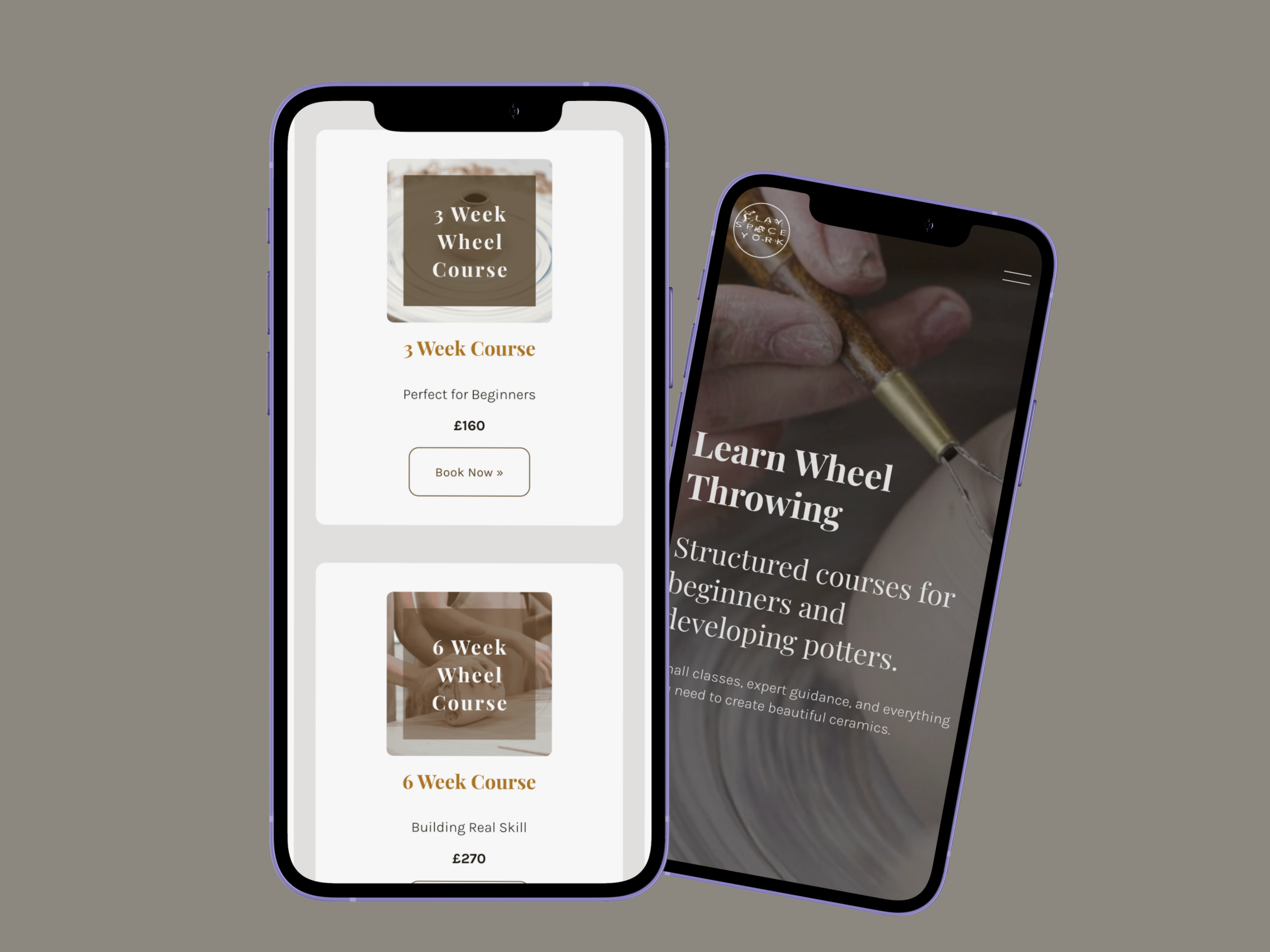
Because every Acuity category and appointment type has its own direct scheduling link, the booking system didn't have to live on a single "Book Now" page. The Courses page shows only courses. The Experiences page shows only experiences. Nobody scrolls past things that aren't for them.
Everything else runs itself: confirmations, reminders, intake forms, capacity counts. The studio team got a written guide for adding new dates, so the system stays clean as it grows.
Not every business needs this much machinery, and I've written elsewhere about where that line sits. A studio selling four different things off one shared calendar sits firmly on the other side of it.
Found by the people looking for it
In February 2026, there was essentially no established search presence for ‘Clay Space York’. No site, no history, no brand searches.
The SEO work started before a single page was designed. Every page carries its own title and meta description written around how people actually search locally — pottery classes York, pottery studio York, wheel throwing York. Headings, URL structure and image alt text follow the same terms. None of it was retrofitted afterwards — it's the approach I set out in SEO on Squarespace: what matters and what doesn't, applied to a domain with no history whatsoever.
Then the part most new sites skip. The sitemap went to Google Search Console on launch day rather than waiting to be crawled, and the site was indexed within days. The spring courses were findable in search almost as soon as they were bookable — which matters more than it sounds, because a course that fills six weeks before it starts has to be visible six weeks before it starts.
Angela launched a Google Business Profile for Clay Space York in the same week. The two do different jobs and neither replaces the other — the profile wins the map, the website wins the organic results underneath it — and running both from day one is why a brand-new name started appearing in local search as quickly as it did.
The name itself was the slower job, and the one that proves a new business has landed.
Both worked:
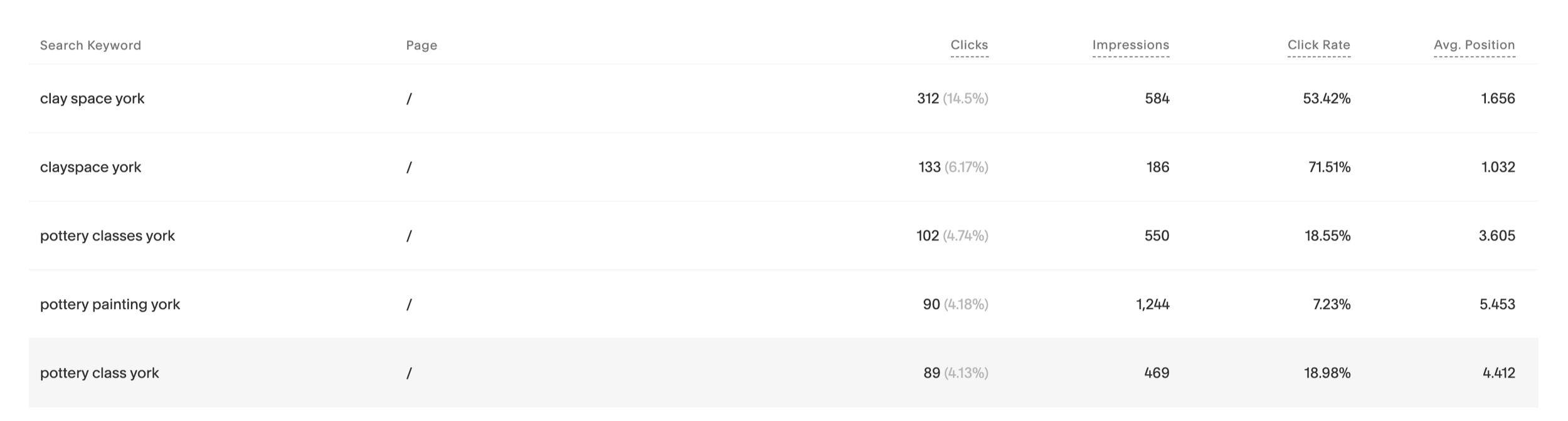
Around 2,150 clicks from Google search
Top five for the local terms that matter: pottery classes York (average position 3.6), pottery studio York (3.6), pottery making York (4.2), pottery course York (4.4)
464 clicks from people searching "Clay Space York" by name — average position 1.7, click-through rate above 53%
That last one is the number I'd point at. Nobody searched for this brand in January. It now has search demand of its own, separate from the sister studio — which is the clearest evidence you can get that the separation worked.
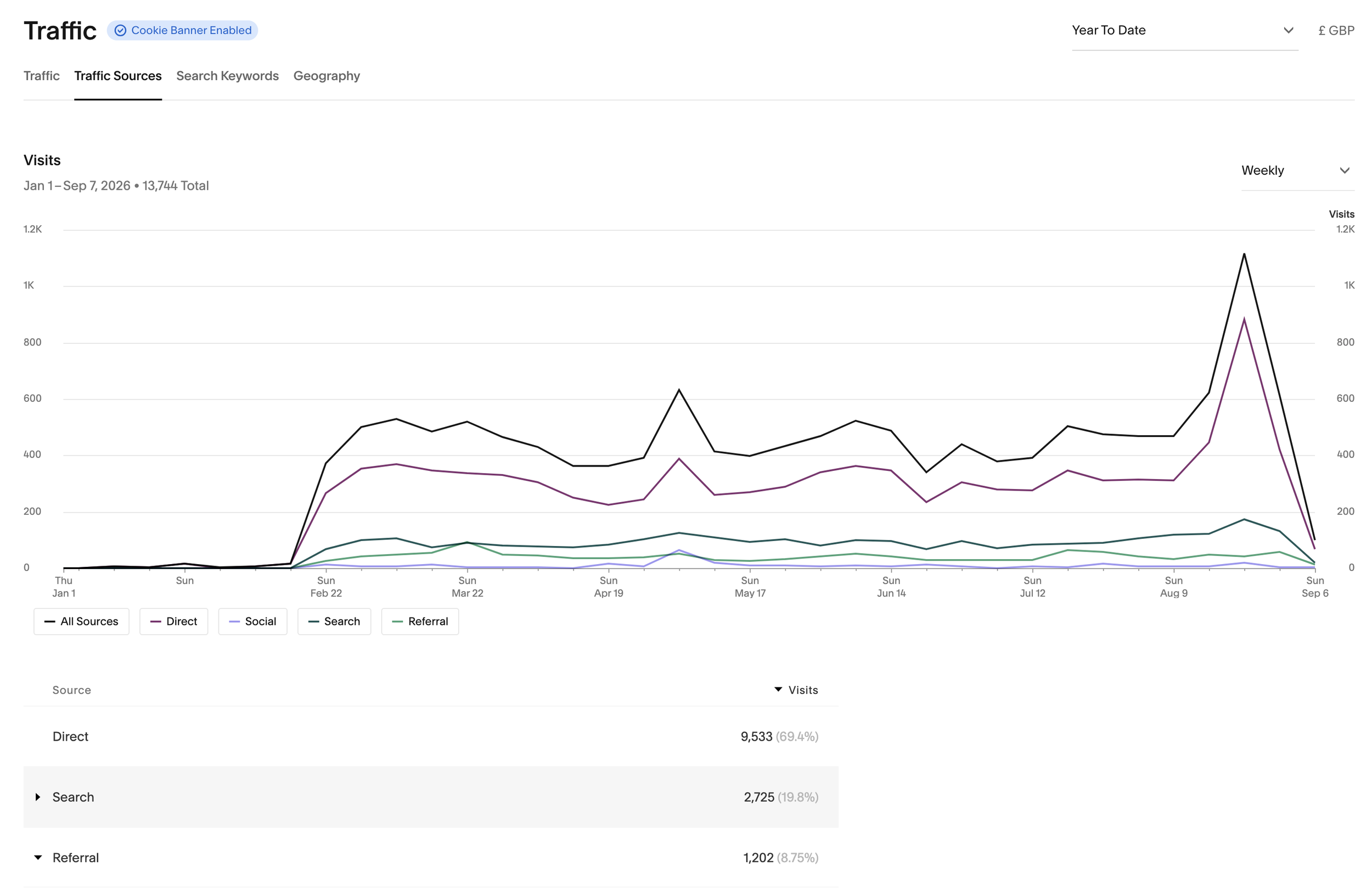
And the traffic goes where it should. 13,700 visits, and the Courses and Experiences pages account for 40% of all page views. People aren't landing and drifting. They're landing and going straight to the things that make money.
Some of those visits arrive from Bish Bash Pot. Separating the two brands was never about severing them — the sister studio still points people towards Clay Space, and referrals now account for just under 9% of all traffic. Someone who came in to paint a mug can find their way to a wheel-throwing course without either studio having to explain itself twice. That was the point of doing the split properly rather than simply splitting the site in half.
Ghost Week: when the system had to flex
In August, Clay Space was invited into York Ghost Merchants' Ghost Week — a city-wide festival with a serious local following.
Angela emailed on a Wednesday. The page needed to be live within days, with sixteen bookable sessions across eight days, twenty places each.
We built a dedicated landing page — Tavern Mug Making Workshop — with its own Acuity event setup, reusing the existing course-details component so it matched the rest of the site rather than looking bolted on. The SEO call was to target York Ghost Week and mug-making rather than the festival's own branded name, which was never going to be winnable.
52 tickets sold in the first six days.
One detail worth keeping: after launch we spotted that the festival's own programme listing was sending people to the Clay Space homepage rather than the workshop page. We added a Ghost Week button to the main navigation to catch them. Small fix, meaningful difference — and the sort of thing you only find by watching where people actually land.
Oh — and it's beautiful
You'll notice I've got this far without mentioning how it looks.
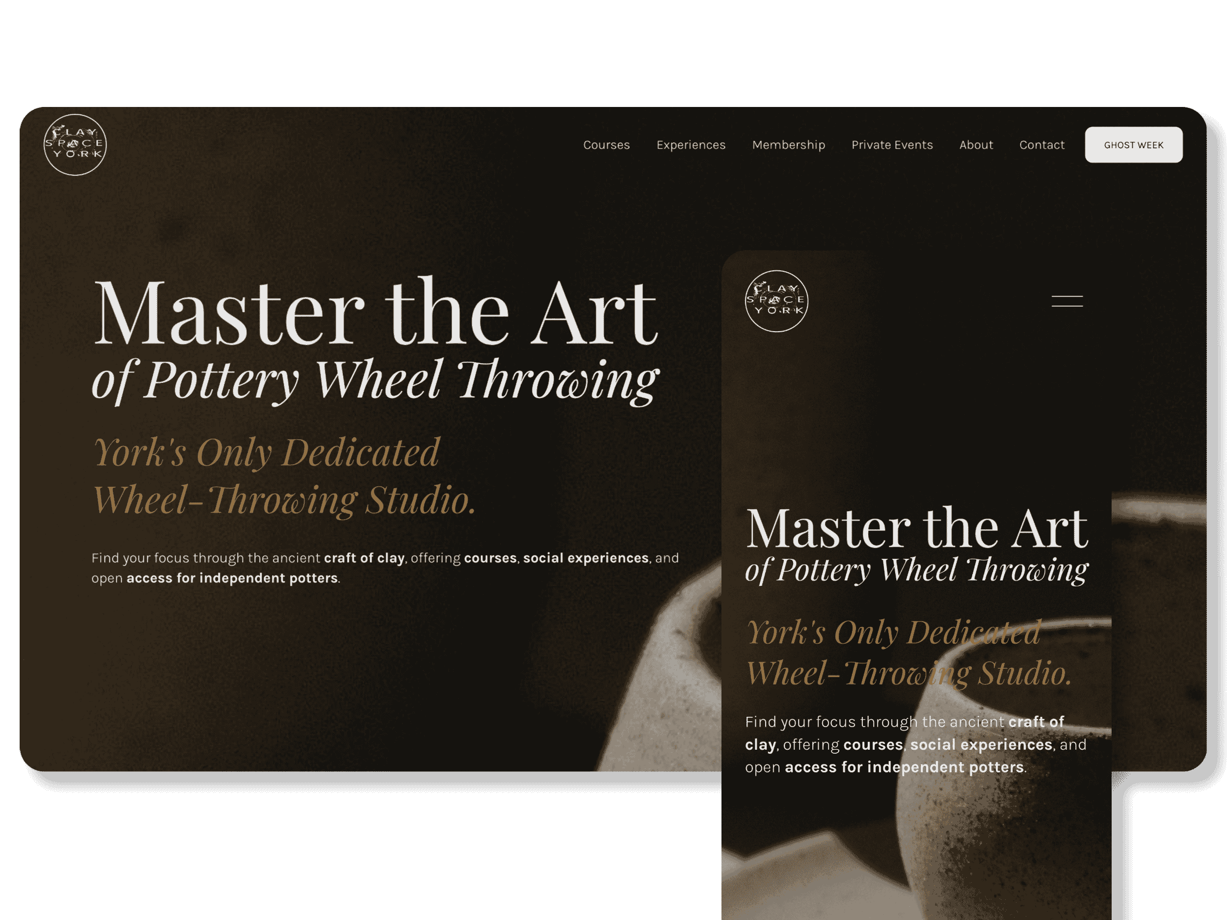
That's deliberate, but it isn't the whole story. Angela was specific about atmosphere from the first conversation. She wanted the site to feel like the studio feels: Japandi restraint, Wabi Sabi honesty, natural materials, lots of white space, nothing shouting.
Which is easy to say and hard to build. Calm design usually means low contrast, and low contrast usually means nobody can find the booking button. The whole job was holding both at once — a site that feels like the room, and still tells you exactly where to go next.
The photography does most of the work, and all of it is real. Wet clay on the wheel. Hands mid-throw. Finished pieces on the shelf, made by people who came to a course. Rooms with actual students in them. No stock imagery, no borrowed atmosphere — which matters, because someone deciding whether to spend a Tuesday evening throwing pots wants to see the room they'll be sitting in.
Playfair Display carries the headings, with Karla underneath it for everything you actually read. Charcoal and warm greys through the rest, so the photography stays the loudest thing on any page. Then a gold, used sparingly. The gold is what stops the restraint tipping into austerity — it's the bit that adds the grace.
And a few things that keep it from sitting still. An animation on the hero of every page, so the site has a pulse. Subtly animated buttons and section components coded in CSS rather than assembled from stock blocks, which is what keeps the small details consistent from one page to the next.
Two lines anchor the whole thing:
Find Clarity in the Clay
Where the Noise Stops and the Craft Begins
Which also, quietly, does the brand separation. None of that language belongs to a pottery painting studio.
None of this is decoration. The look tells the right person, in about two seconds, that this is a serious making studio rather than a craft afternoon — and it does that by looking like the clay, the light and the quiet you'd actually find at Melrose Yard. It resonates with the people it's meant for. That's what earns the click.
The system is just what makes sure the click turns into a booking.
What this says about creative business websites
Most makers I speak to think they need a better-looking website. Usually what they need is a website that does the admin. That's the real gap. Creative business websites tend to be galleries when they need to be shopfronts. They show beautiful work, then ask the visitor to send an email — which is exactly the point where most people don't bother, and where the ones who do start costing you ten minutes each. If you make things and you teach things, your website should be able to sell both while you're at the wheel. This case study sits alongside broader research into how artists and makers get found online — you can read that in Artist Websites: What Actually Works.


If your website should be doing more than looking good
If you teach, run courses, sell experiences or manage a membership, your website can carry that work for you. Let's talk about what that would look like for your business.
Book a Discovery Call →
Key Features:
- Blog Setup
- Brand Identity
- Brand Strategy
- Calendar Booking Integration
- Contact Forms
- Custom CSS
- E-commerce
- Lead Capture
- Logo Design
- Minimal Style
- Mobile Optimisation
- Organic Style
- Payment Processing
- Playful Style
- Positioning
- SEO Optimisation
- Target Audience Definition
- Third Party Integration
- Visual Identity
- Website Build
❝
Anna is a patient and professional designer who has built a website for me from scratch. I'm so pleased with the final outcome and I've really enjoyed working with her. It was quick, easy and communicating what I wanted was straightforward. Thanks Anna for a lovely website that is working well for my customers!
❞
— Angela Collinson, Founder, Clay Space York
How Projects Like This Come TogetherWhat to Expect
Every project follows a collaborative process designed for clarity, partnership, and results you'll love.

Discovery & Strategy
Week 1
We start with conversation—understanding your business, audience, and goals. This shapes everything that follows.
What You Get: Clear project timeline, strategic direction, content plan

Design & Development
Week 1-2
I build your project on a staging site where you can follow progress. You'll receive a complete first draft with a video walkthrough explaining every design decision.
What You Get: Staging access, video walkthrough, feedback opportunities

Review & Refinement
Week 2-3
Your feedback shapes the final result. We discuss changes, I implement revisions, and we polish every detail until you're thrilled.
What You Get: Revisions, direct communication, collaborative problem-solving

Training & Handover
Week 3
Your project goes live! You receive comprehensive training (live session + recorded videos), all credentials, and 30 days of support.
What You Get: Platform training, video tutorials, 30 days support, full ownership
Typical Timeline: 2-6 weeks for standard website projects, depending on complexity
Expedited Delivery: Available for time-sensitive projects
Complex Projects: Timeline adapts to your specific needs
Let's Talk About Your Project
Let's start with a conversation.
No pressure, no sales pitch—just an honest discussion about what you need and whether I'm the right fit to help.
Book a Discovery Call
Tell me about your vision and what you're hoping to achieve. We'll talk through your goals, I'll explain how I work, and we'll both know if this is the right partnership. The call is free—no obligation, just conversation.
Or explore more options:
Send a Message → Get in touch via contact form
View All Portfolio → See more examples of our work
Learn About Services → Understand what's included
Read Client Reviews → Hear what others say
See other work in this space:
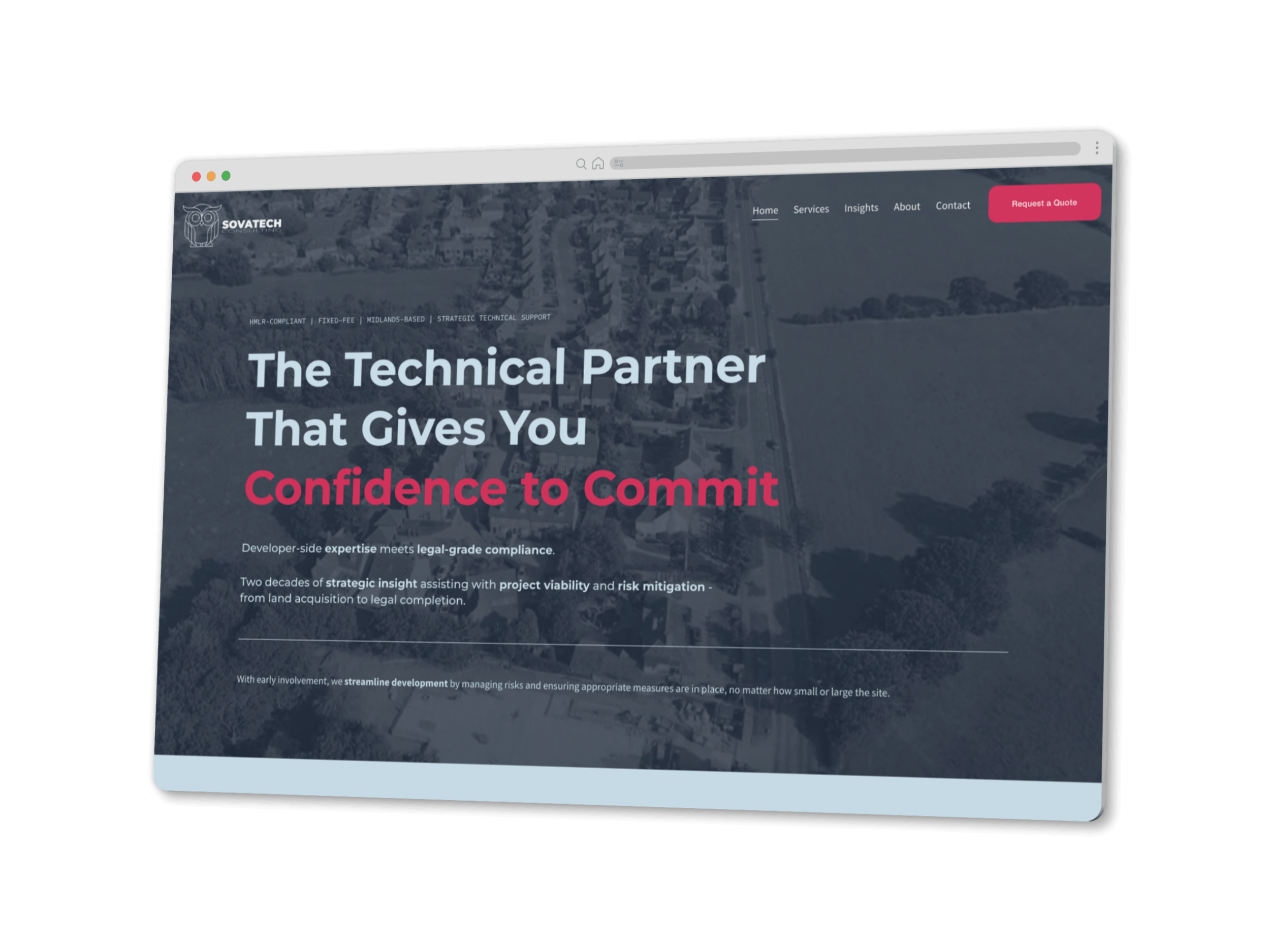

York's only dedicated wheel-throwing studio was selling courses, taster sessions, private events and memberships entirely by email. Now the website does it.