Your Craft Deserves to Be Found: What I Learned from 239 Artist Websites
Of every industry I work with, creative businesses have always held my attention the longest.
Partly it's background. I trained in architecture, spent years in studios and at private views, and I still collect work when something genuinely stops me. Several of my closest friends are artists. It's a world I understand from the inside, not from a marketing brief.
But affection isn't insight. So this time I decided to actually do the homework.
The NROS brochure — Northants & Rutland Open Studios — came into my hands at an event. Two hundred and thirty-nine artists across four regions. Painters, printmakers, ceramicists, jewellers, textile artists, sculptors. A genuinely impressive directory of people making beautiful things within an hour of where I live.
I looked up a few of them out of curiosity. Then a few more.
By the time I'd worked through thirty or forty, curiosity had turned into something more methodical. I didn't sample the obvious names. I worked through the entire directory — every artist listed, one at a time, recording what I found.
What emerged over the following months was more revealing than I expected. Some of it was uncomfortable. Some of it was genuinely reassuring.
Northants & Rutland Open Studios · Independent Research
What reviewing 239 artists revealed
Artists reviewed
239
Every artist in one open studios directory
No space of their own
42%
101 artists on rented platforms, or nowhere at all
Coherent visual identity
1 in 5
A consistent voice across every touchpoint
No brand identity
49%
Nothing carrying from one place to the next
Research by Anna Hamilton, AH Studio · 239 artists reviewed May–September 2026 · ahstudio-design.com
Forty-two per cent had no space of their own
Let me start with the number that stayed with me.
One hundred and one of the 239 artists had no space of their own. Not an outdated site. Not a placeholder. Nothing they controlled.
Their online presence lived on Instagram, on Etsy, in a shared directory listing — or, in a handful of cases, nowhere beyond the brochure entry itself.
That distinction matters more than it might sound. A platform you rent is not the same as a place you own. Instagram decides who sees your work. Etsy decides where you appear in a search and takes a cut of what you sell. Neither will still be serving your practice in ten years on terms you set.
One hundred and one of the 239 artists had no space of their own. Not an outdated site. Not a placeholder. Nothing they controlled.
These are working artists. People with practices, techniques, bodies of work developed over years. During open studios weekend, hundreds of visitors walk through their spaces, admire the work, take a card. And then the weekend ends.
I kept thinking about the collector who visits in June and wants to buy something in November. The gallery curator filling a programme in a specific medium. The journalist writing about regional makers. The commissioner looking for something original for a new building.
All of them start in the same place — a search box. Most of them find very little, because being findable is a decision you make deliberately, not something a website does on its own.
How I did this research
I reviewed every artist listed in the NROS brochure — 239 in total — and recorded whether they had a website of their own, which platform it used, the overall quality of the site, and the coherence of its visual identity. I assessed each one individually rather than sampling. E-commerce and booking functionality weren't part of the dataset.
What they were building on
Here's where I have to declare an interest. I build on Squarespace. I'm a Gold Partner. I'm not remotely the most neutral voice in the room on this.
Which is precisely why I recorded the data before forming an opinion — and why I'll give you the numbers rather than the conclusion.
WordPress was the most popular choice
Accounting for roughly a quarter of the websites I found. Just under half of those I rated as good. That split is the interesting part. Artists with a properly built custom WordPress site often had something excellent — sophisticated galleries, considered typography, genuine craft in the build. Artists on a free WordPress.com blog, or a theme bought in 2016 and never revisited, had something that actively worked against them.
Wix came a close second
Also around a quarter. Roughly fifteen per cent of those I rated as good. Default template names still visible in the browser tab. Galleries that broke on mobile. Contact pages with no form on them. Several still running on free wixsite.com subdomains.
Squarespace accounted for a smaller share
Around one in six of the sites I found. Just under eighty per cent of those I rated as good.
I'll admit I found that reassuring, given where I've built my practice.
But I don't think the honest conclusion is use this platform. Look again at the WordPress split: the same platform produced both the best sites in the sample and some of the worst. The variable wasn't the software. It was whether the site had been built appropriately for the person who had to live with it, and whether anyone had touched it since.
That's the real finding. A platform that suits how you actually work, built to a standard you can maintain, will outperform a technically superior platform that demands attention you don't have. The artists with the weakest websites — old Weebly builds, abandoned Clikpic pages, free portfolio subdomains — hadn't made bad decisions. They'd made a reasonable decision five or eight years ago, and nobody had since mentioned that the ground had moved.
Platform Analysis
What they chose — and how it turned out
Across the 138 artists with a website of their own
Platform of choice
Share of artist websites
Sites that represented the artist well
Clear galleries, readable on a phone, easy to contact
The most popular platform produced some of the weakest results. Wix accounts for a quarter of all artist websites; fewer than one in six represented its owner well. Shopify scored highest but serves a different purpose — every artist using it was already selling.
The pattern I noticed but didn't measure
There's one thing I kept seeing that I wish I'd recorded properly, so I'll flag it as an observation rather than a finding.
Site after site presented the work as pure portfolio. A gallery, an about page, sometimes a contact form. Beautiful, considered, and offering the visitor nothing to do beyond look.
I wasn't logging whether each site could sell, so I won't put a number on it. What the platform data does show is that eight artists had chosen Shopify and seven were selling through Etsy alone — fewer than one in ten of the directory using a selling-first platform or relying on Etsy alone.
That is not proof. But it points at something worth taking seriously: for most of these artists, there is no obvious route from I love this to how do I get one. And that gap is entirely fixable.
What a creative practice can sell online
This part isn't research. It's a decade of building these sites and watching which parts earn.
Work, at every price point.
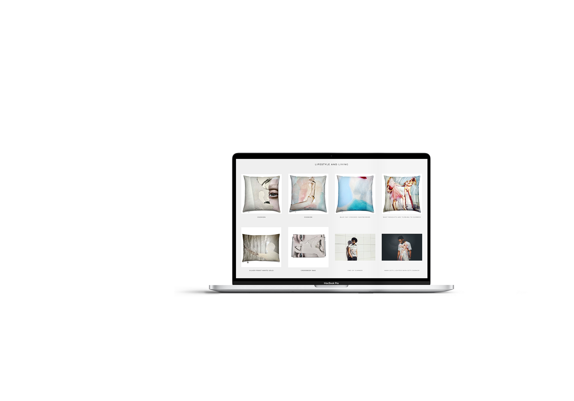
Originals individually listed with dimensions, medium and a clear price. Limited editions, numbered and finite. Open-edition prints as the lowest barrier a new collector will ever face — someone who spends £45 on a print can become a prospect for a £900 original later. That relationship can't start if there's nothing to buy. The DOK-ART project was built around exactly this problem: holding originals, editions and prints on one site without any of them cheapening the others.
Commissions, structured properly.
A page explaining the process, indicating a price range, setting expectations on timescale, capturing the enquiry with a form that asks the right questions. Not a mailto link and a hope.
Teaching, in all its forms.
Workshops, courses, one-off experiences, studio membership. Often the steadiest income a creative practice has, and the one most likely to be run entirely through email. Clay Space York was built around this: courses, experiences, private hire and monthly membership, each with its own booking path. The site handles the scheduling admin that used to eat a working day a week.
Knowledge, packaged.
Technique guides, pattern downloads, glaze recipes, video tutorials, paywalled course content. Made once, sold indefinitely. Squarespace handles member areas natively now — fifteen years of technique can become something that earns whilst you're in the studio.
Products around the work.
A book, a zine documenting a body of work, cards, materials kits, gift vouchers. The Buffalo Girl project sat here: an artisan leather maker whose photography and site structure had to carry the tactility of the material itself, because nobody buys handmade leather from a badly lit photograph.
A collector list.
For anyone who genuinely has nothing in stock, this is the highest-value thing to build. Emails from people who liked something you'd already sold. A note when the next body of work exists. Worth more than any social following, because you own it.
Licensing sits alongside all of this — surface pattern, editorial illustration, product application. A page saying this work is available to license costs nothing and opens a door.
Most artists need two or three of these, chosen deliberately. The mistake I see isn't choosing badly. It's never choosing at all, and defaulting to a portfolio that asks the visitor to work out the next step for themselves.
The gap underneath all of it
Deciding what to offer is the easy half. The harder half sits underneath — and this one I did measure.
Nearly half the artists had no coherent brand identity whatsoever. No consistent palette. No typographic voice. Nothing carrying from one touchpoint to the next.
Only around one in five had what I'd describe as a strong, coherent visual identity.
I want to be careful here, because I understand the discomfort. There's a real tension between artistic practice and commercial presentation, and I'm not suggesting every painter needs a brand strategy deck.
The roughly fifty artists with the strongest coherence had done something quietly sophisticated. Their visual identity wasn't imposed on the work. It grew from it.
A ceramicist whose website palette was drawn directly from her glazes. A printmaker whose typography carried the same weight and restraint as her linocuts. A textile artist whose site had the tactile, layered feel of the work itself. In each case, the identity was an extension of the practice rather than a wrapper around it.
That's not marketing. That's the same sensibility that produced the work, applied one layer out — which is exactly what branding that grows from the work itself should be.
Which is really the whole argument. What I'm describing isn't a marketing exercise — it's closer to hanging a show properly. Space, sequence, clarity about what the viewer meets first. Every artist reading this already has that instinct. It just tends to stop at the studio door.
And it showed in the ratings. Those sites were consistently the ones I scored highest — not because they were prettier, but because coherence is legible. A visitor can tell within seconds whether a decision has been made about who this is for.
Nearly half the artists had no coherent brand identity whatsoever. No consistent palette. No typographic voice. Nothing carrying from one touchpoint to the next.
Open Studios Research
Presence & identity across 239 artists
A space of their own
All 239 artists
Brand coherence
All 239 artists
What the strongest sites had in common
They weren't the most technically ambitious. They shared something simpler.
The work was given room. Large images, generous spacing, no competing decoration — presented the way you'd hang it, not the way you'd file it.
There was a person behind it. Not a five-hundred-word biography, but enough that you understood the perspective, the material, why this and not something else. Collectors aren't only buying the work; they're buying into the person and the practice behind it.
Getting in touch was frictionless. A form. On the page. Asking useful questions.
And there was an obvious next step. Buy this, book this, join the list, start a conversation. One clear action rather than an invitation to admire and leave.
Four things. None of them expensive. Most of the sites I reviewed were missing at least two.
What I'd say to any artist reading this
The talent in that brochure is not in question. It never was.
What's missing, for most, is the layer between making the work and someone being able to find it, understand it, and act on it. That layer is a website built around how you actually work rather than around what a template assumed. The artists who had got this right weren't more commercial than the others. They'd simply extended the care already present in the work one step further out.
I've started reaching out to some of the artists in that brochure, because I'd like to understand this from their side rather than only from mine. If you're one of them — or a maker anywhere else reading this — I'd like to hear how you think about your website. What you've found difficult. What you'd want it to do that it currently doesn't.
Research conducted May–September 2026. Every artist listed in the NROS brochure — 239 in total — reviewed individually for website presence, platform, site quality and coherence of visual identity. E-commerce and booking functionality were not assessed; where this article discusses selling, it does so as professional guidance rather than research findings.
If you found this useful, these might be worth a read too.
Want insights like these straight to your inbox? Subscribe below. 👇🏼