
Education & TrainingLearning Seeds: Educational Platform Expansion for Childhood Educators
Client: Erica, Learning Seeds
Project Type: Website Enhancement & Course Platform Setup
Duration: 1 month
Location: Boston, MA, US
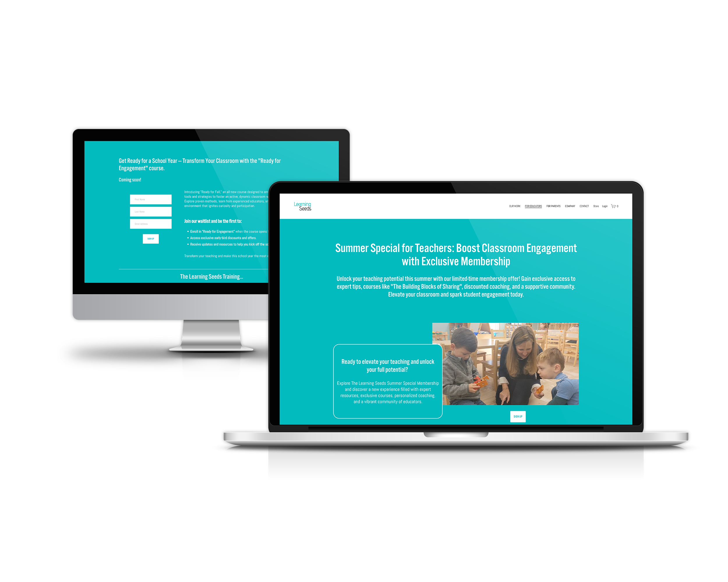
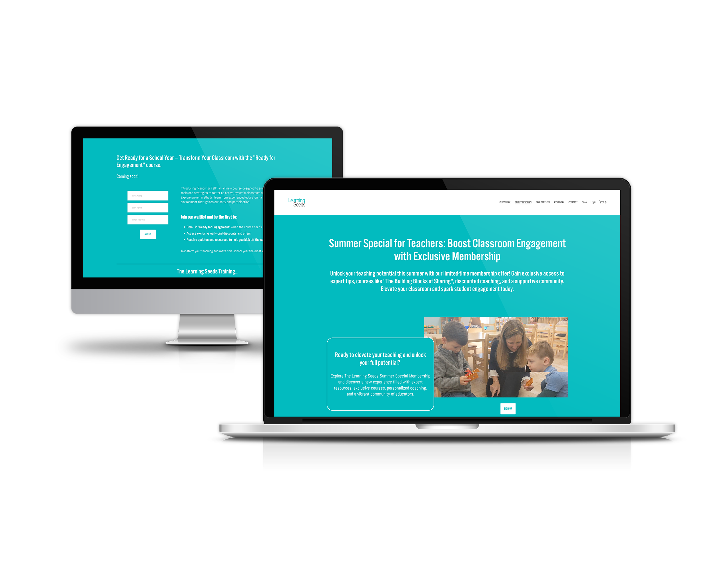
Learning Seeds approached me with an urgent need: transform their existing website to accommodate a new professional development programme for educators.
With a tight one-month deadline and evolving partner requirements, the project required both strategic thinking and flexible execution to create a platform that would convert visitors into enrolled members.
The Challenge
Learning Seeds had built a reputation providing social and emotional learning resources for preschool children. Now they were expanding into professional development courses for educators—but their existing website wasn't structured to support this growth.
The challenge wasn't just adding pages. It required rethinking the user journey to serve two distinct audiences (parents seeking resources and educators seeking training), creating a membership structure that felt exclusive yet accessible, and building a course platform that made enrolment intuitive. All whilst maintaining their playful, mission-driven brand identity and hitting an immovable launch deadline.



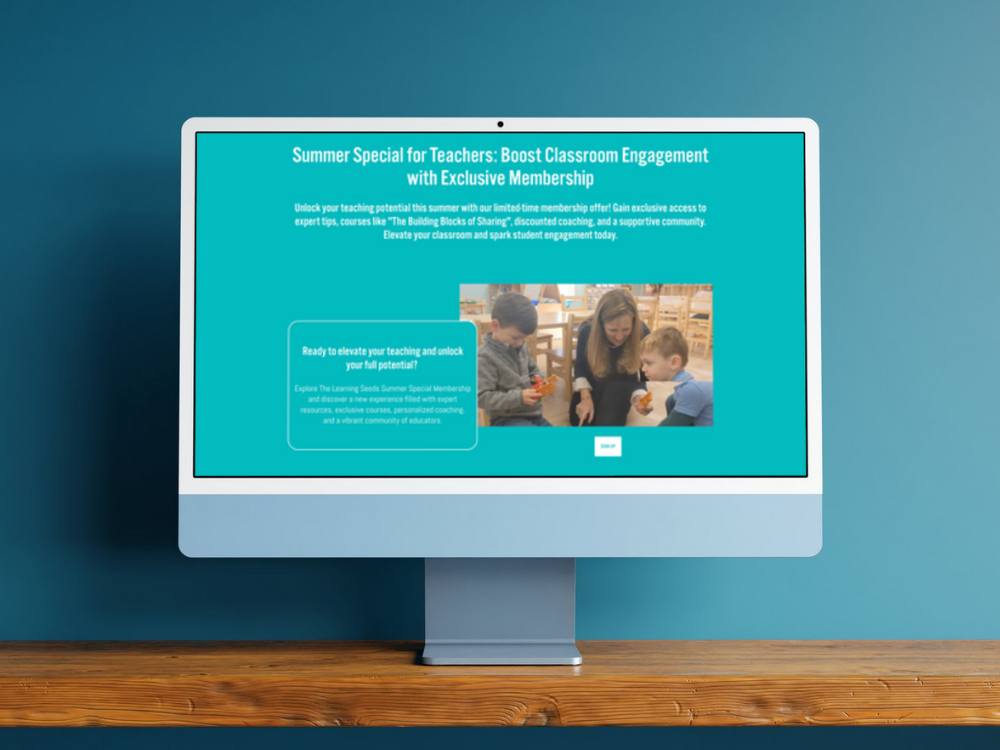
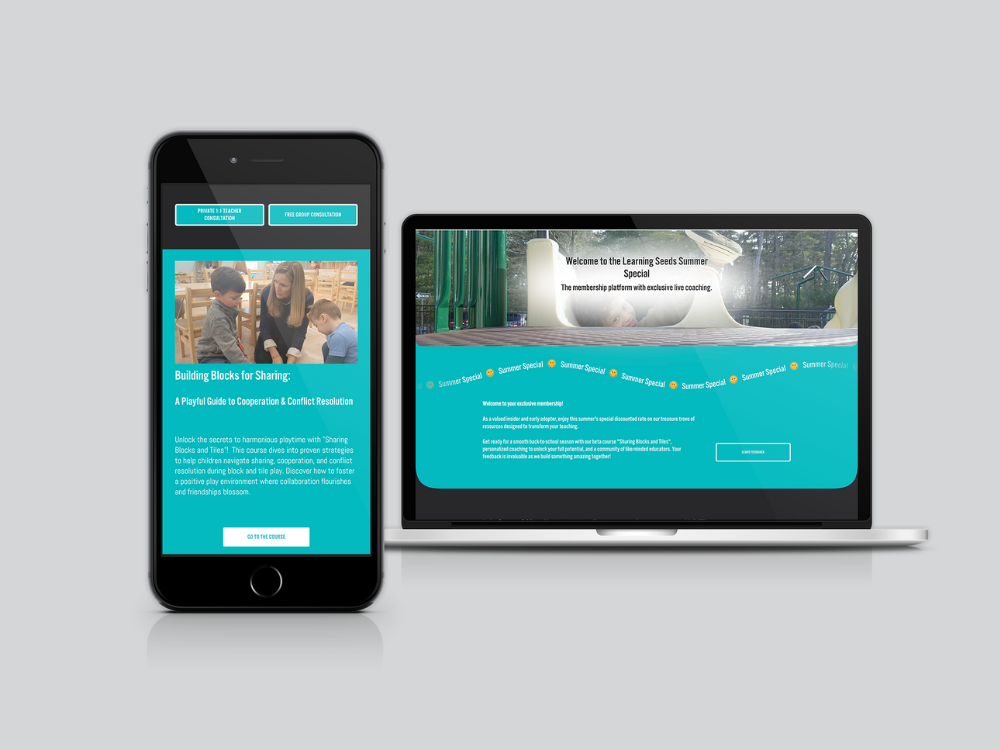
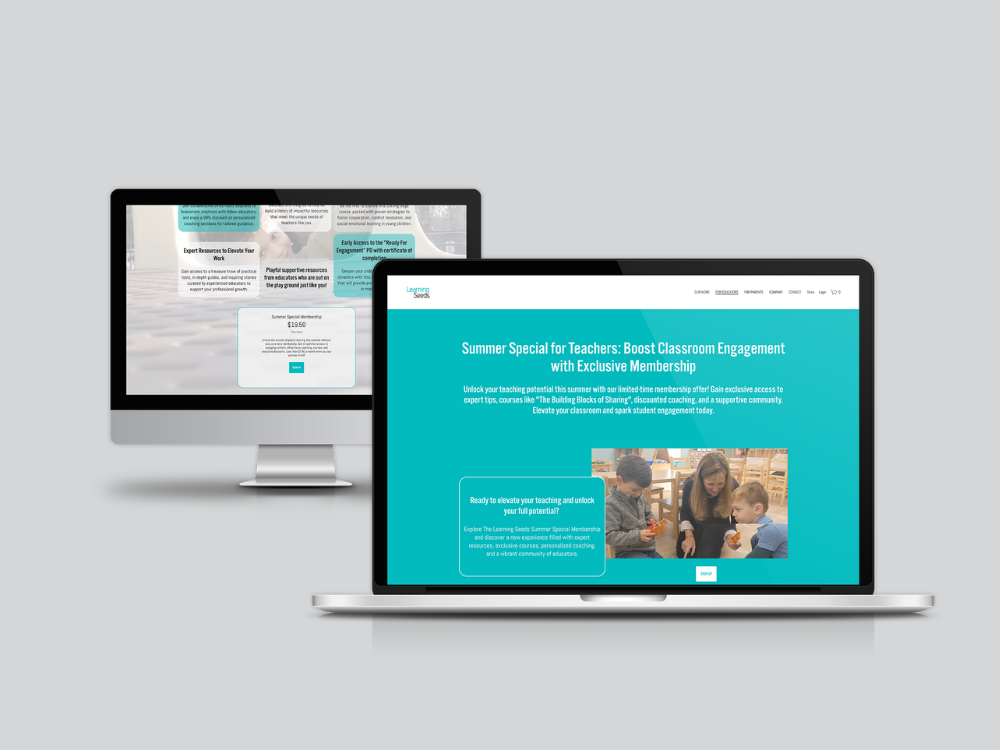
Strategic Approach: Segmented User Journeys
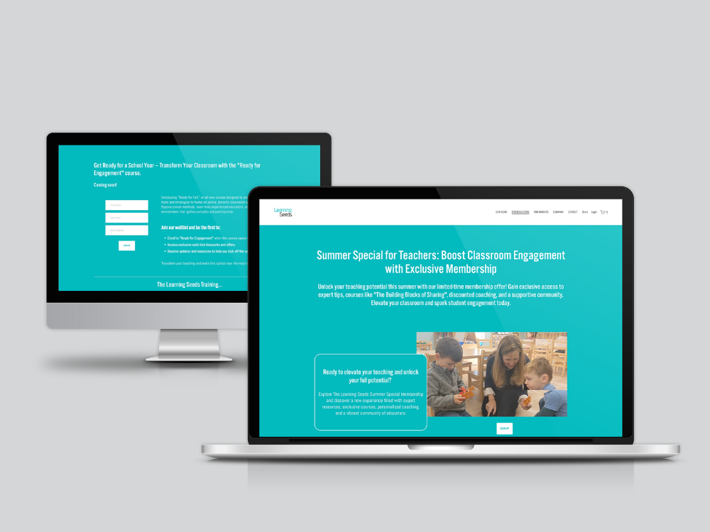
Rather than cramming everything onto existing pages, I restructured the site to create clear pathways for different user needs. This required strategic content segmentation—determining which resources belonged in public areas, which lived behind the membership wall, and how to guide educators seamlessly from discovery to enrolment.
The navigation was streamlined to surface key information quickly. For educators researching professional development, the path from landing page to course catalogue to registration needed to feel natural, not forced. For existing members, accessing their exclusive content required minimal clicks.
Building the Course Platform
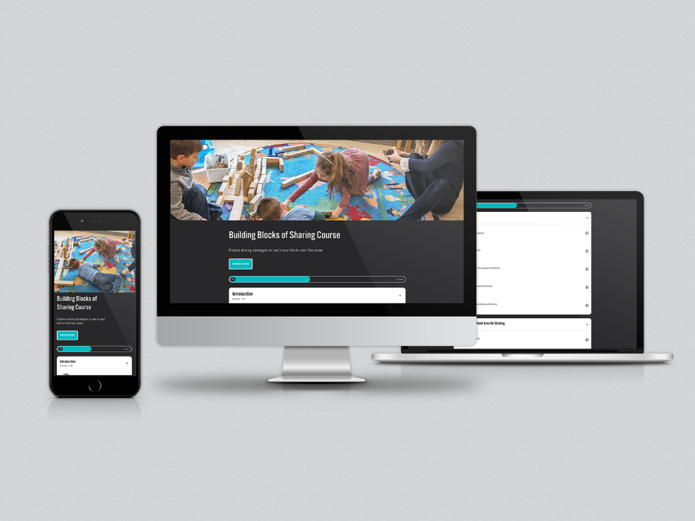
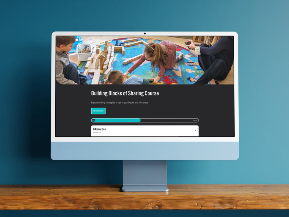
Using Squarespace's course functionality, I designed individual course pages that balanced comprehensive information with visual appeal. Each course needed to communicate its value proposition clearly whilst maintaining the playful aesthetic that makes Learning Seeds distinctive.
The courses landing page became a strategic tool—not just a catalogue, but a persuasive argument for why educators should invest in this professional development. I incorporated testimonials from early participants to build credibility and structured course information to highlight tangible benefits alongside learning outcomes.
Membership Area: Creating Value
The member area required careful consideration. Members needed to feel they were accessing something exclusive and valuable, whilst the structure itself needed to be intuitive enough that educators could find resources without friction.
I created a personalised dashboard approach where members could manage their profiles and access premium content. The community forum provided space for educators to connect and share insights—transforming the membership from a transactional relationship into a collaborative learning community.
Acuity Scheduling Integration
Beyond the visual design, the technical setup of Acuity Scheduling ensured educators could book course sessions seamlessly. The integration needed to work invisibly—instructors managing availability on the backend, whilst educators experienced a smooth booking process on the frontend.
Key Features:
- SEO Optimisation
- Website Build
- Positioning
- Custom CSS
- Minimal Style
- Brand Identity
- Logo Design
- Brand Strategy
- Target Audience Definition
- Mobile Optimisation
- Payment Processing
- Contact Forms
- Playful Style
- Organic Style
- Visual Identity
- Third Party Integration
- Migration
- E-commerce
- Blog Setup
- Lead Capture
The Outcome
The platform launched on schedule despite shifting timelines. Shortly after going live, Learning Seeds began receiving course and membership bookings from educators—validating both the strategic direction and the execution.
The success demonstrates how thoughtful information architecture and user journey mapping can transform a website from a digital brochure into a conversion-focused platform. When you understand your audience's needs and remove friction from their path to action, results follow.
❝ Anna has a heart of gold and truly cared about our mission, and this project. We had an extremely tight deadline and she did her best to find ways to stay on track as our partners shifted launch deadlines. If you head to our website you will see a playful, on brand landing page that Anna created that makes me giggle and smile each time I see it. She had good suggestions for how to approach the segmentation of our content and a very collaborative 'we can' attitude. We'd love to work with her again.❞
— Erica Key, Learning Seeds CLO & Co-Founder

See other work in this space:
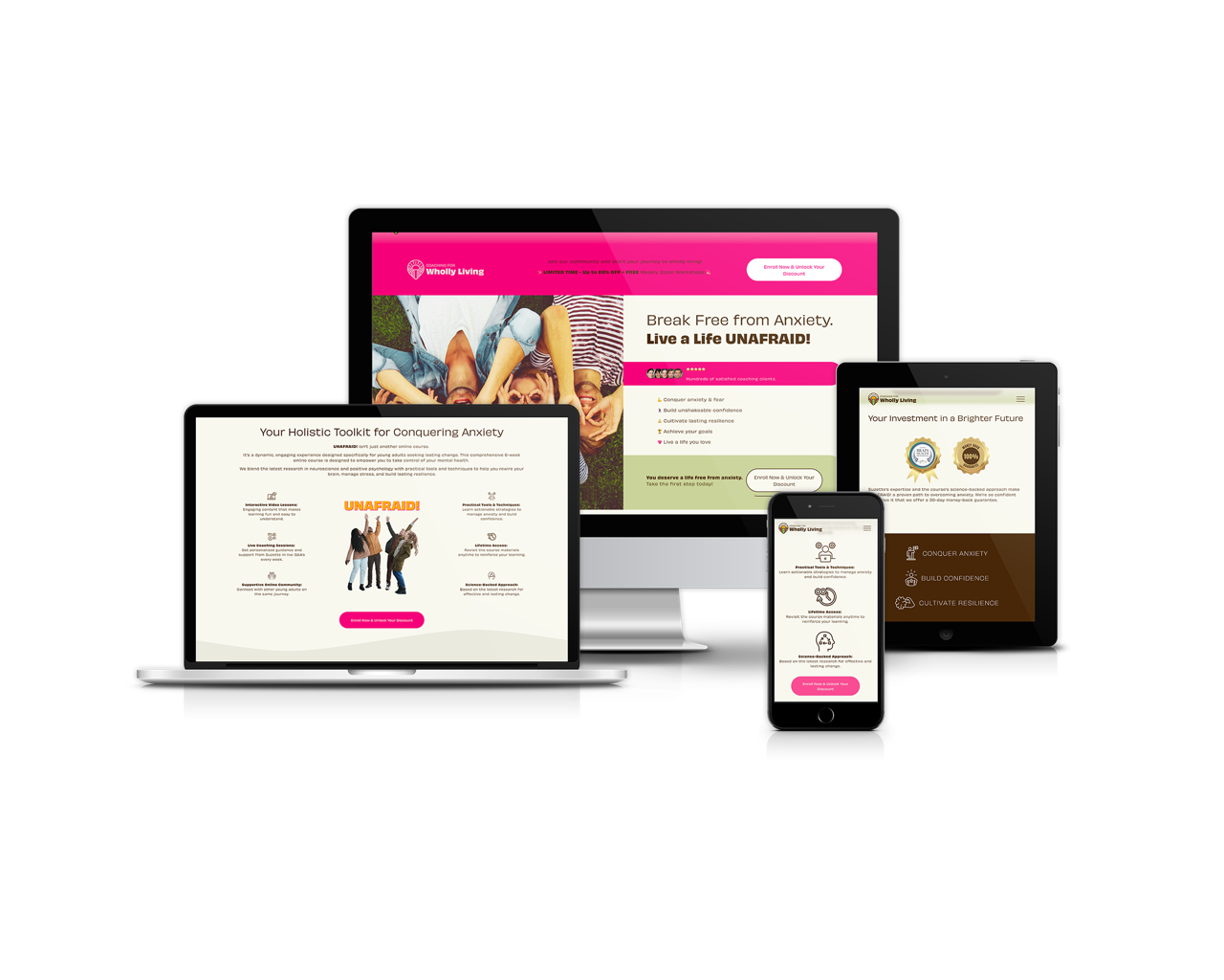



York's only dedicated wheel-throwing studio was selling courses, taster sessions, private events and memberships entirely by email. Now the website does it.