
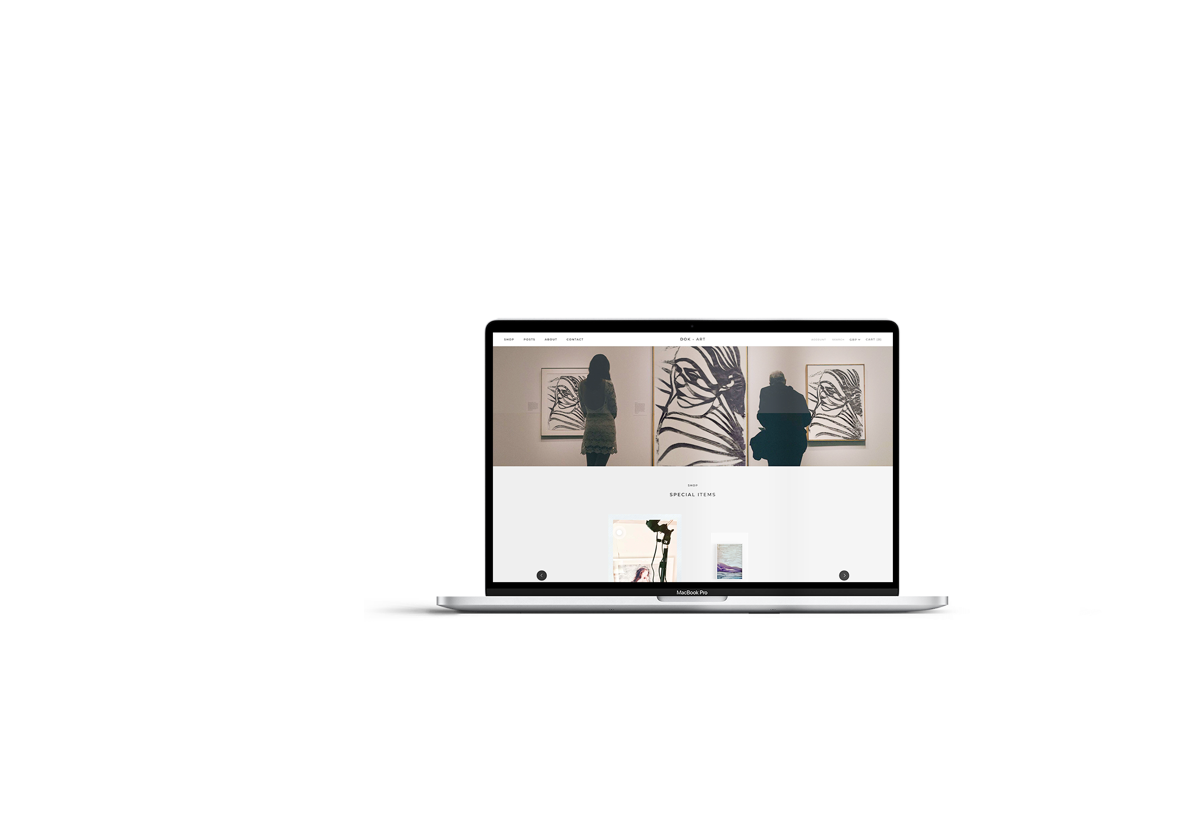
Creative & ArtsArt Gallery E-commerce Website
Client: Joanna Bloniarz, Artist, DOK ART
Project Type: E-commerce Website Design + Digital Mockup Creation
Duration: 2 weeks website build, ongoing updates
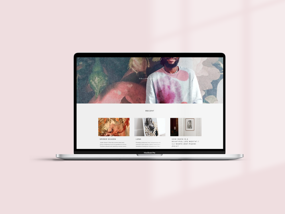
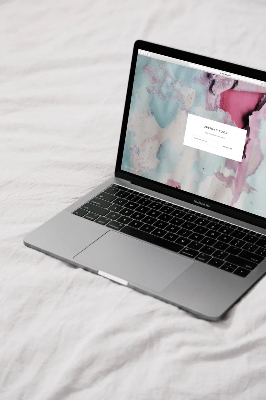
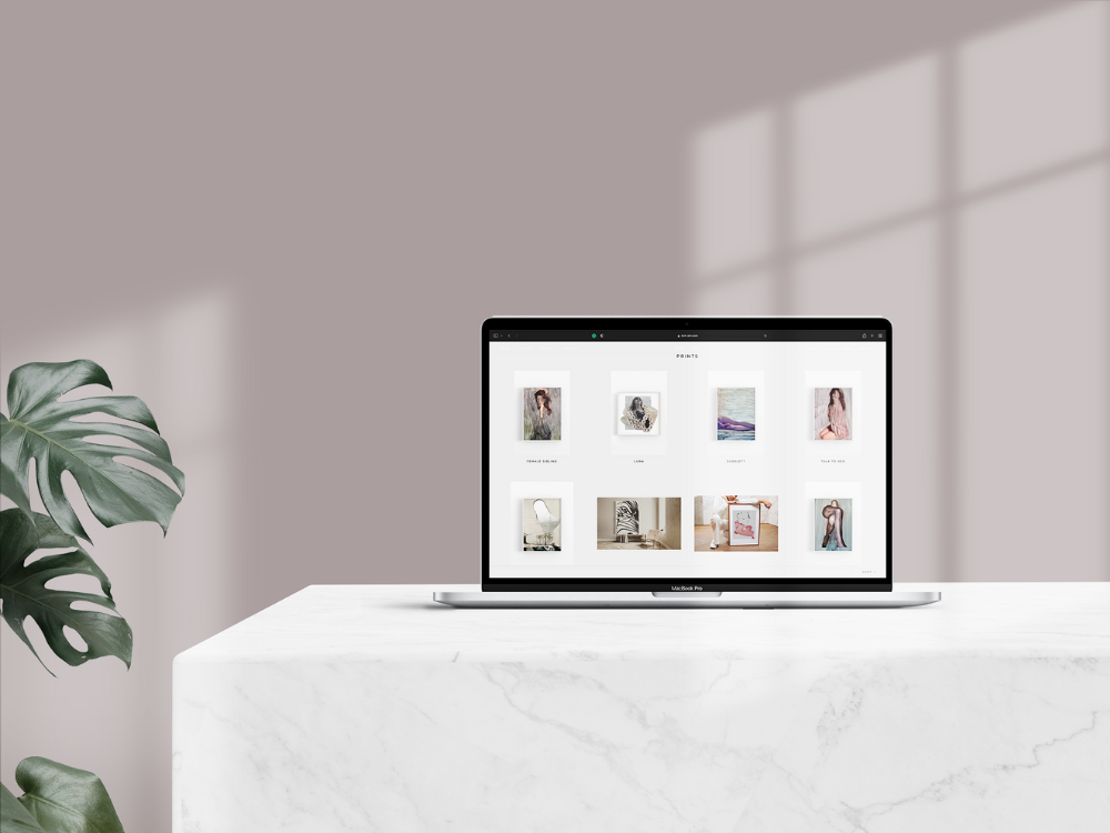
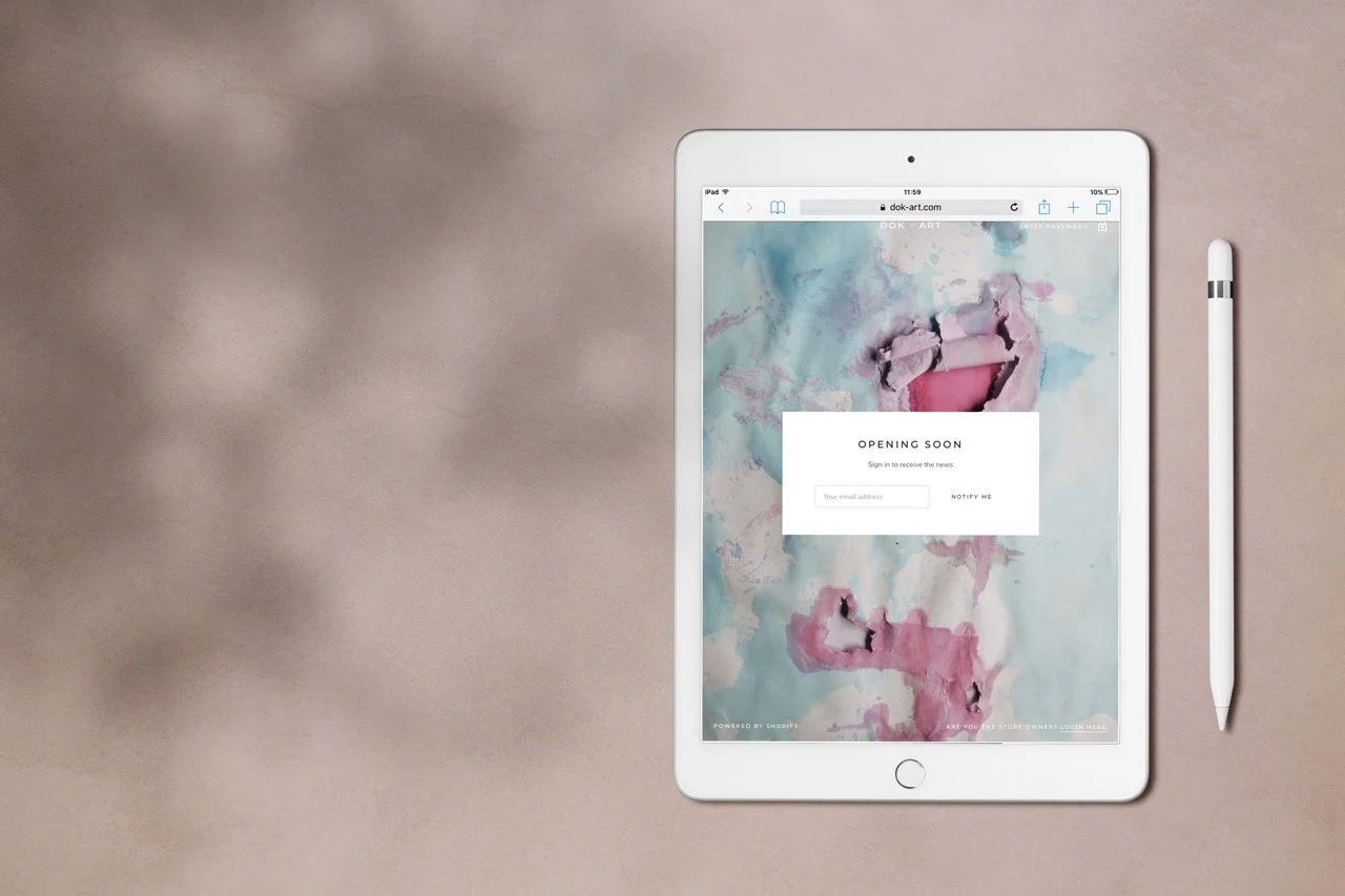
A modern artist needed an e-commerce platform that wouldn't compete with her artwork but would enhance it. I created a minimalist website where each page functions as a curated installation, balancing stark simplicity with immersive visual impact.
The Challenge
Joanna Bloniarz creates striking modern art—bold, colourful, visually commanding pieces that demand attention. Her challenge wasn't showcasing the work; it was creating an e-commerce platform that enhanced rather than overwhelmed the viewing experience.
The typical art e-commerce approach—dense galleries, cluttered layouts, competing design elements—wouldn't work. Joanna's aesthetic demands space, calm, and intentionality. The website needed to function as an extension of the artwork itself, not just a container for it.
Additionally, each piece required professional presentation through digital mockups, showing the art in context without physical installation costs.
Strategic Approach
The fundamental challenge was reconciling two opposing forces: the boldness of Joanna's artwork demanded visual space and breathing room, whilst e-commerce requires information density and purchase facilitation. Most art websites fail because they either prioritise aesthetics over functionality or sacrifice visual impact for conversion optimisation.
My approach rejected this false dichotomy. Instead, I treated the entire website as an extension of Joanna's artistic practice—each design decision guided by curatorial principles rather than conventional e-commerce patterns. The goal wasn't simply displaying art for sale; it was creating an environment where the act of viewing became inseparable from the experience of the artwork itself.
The Website as Installation
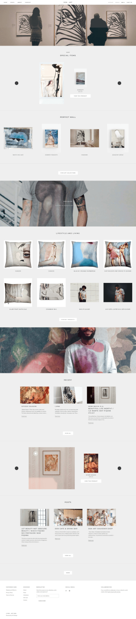
Rather than treating the website as a traditional e-commerce platform, I approached it as a series of curated installations. Each page, each product view, each navigation choice became part of the gallery experience.
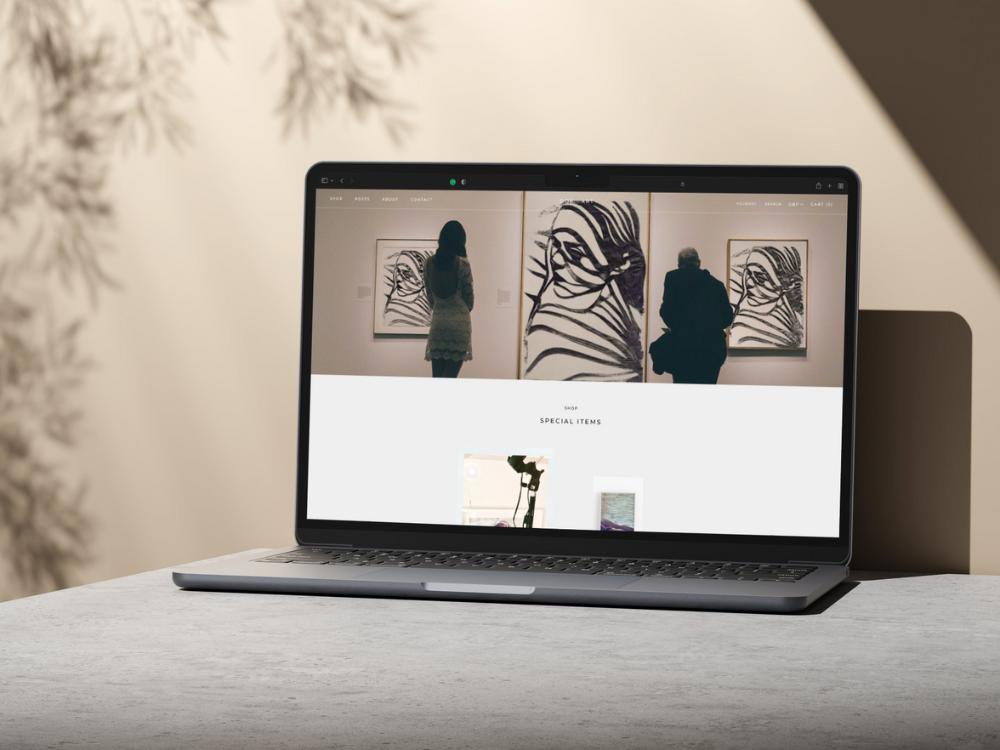
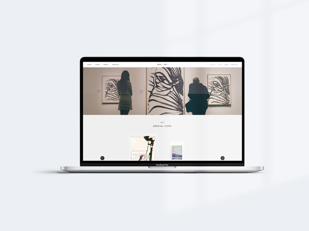
The design philosophy: radical minimalism that serves the art. Neutral backgrounds, generous white space, restrained typography. No visual competition—just the artwork and the space it needed to breathe.
This wasn't about making things simple for simplicity's sake. It was about creating the visual calm that allows viewers to engage deeply with bold, complex artwork.
Organising Artworks as Curated Experience
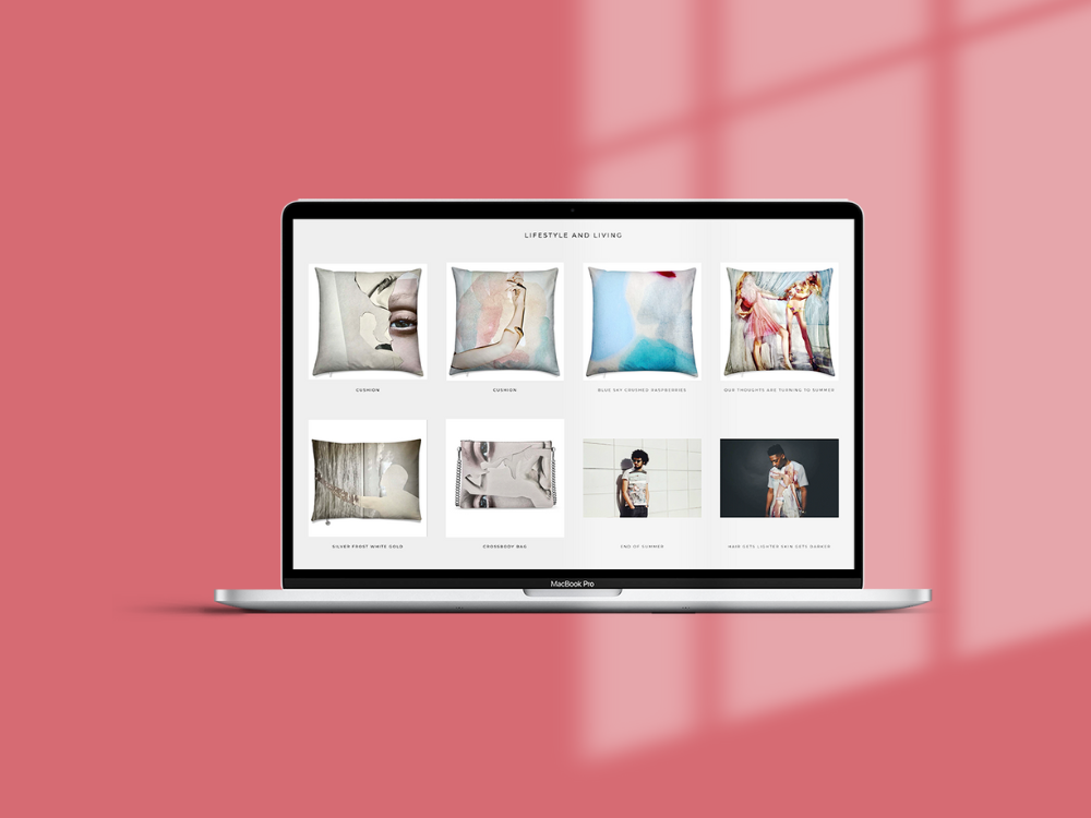
The real design challenge was organisational: transforming individual artworks into a cohesive e-commerce experience that felt intentional rather than chaotic.
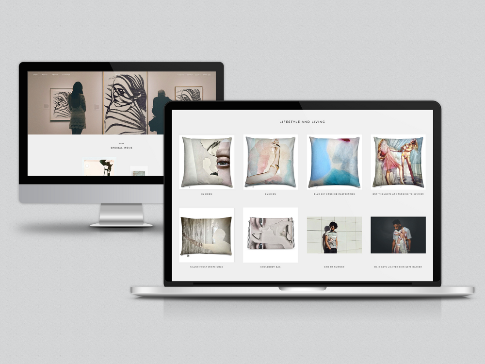
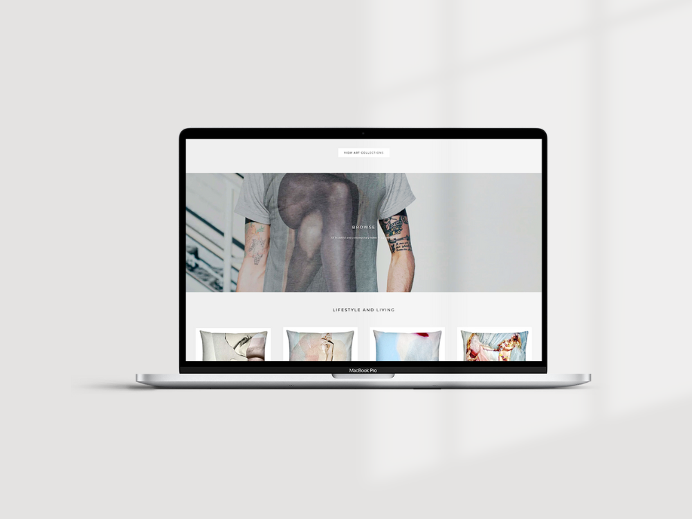
I structured the site architecture around artwork collections and themes, allowing visitors to discover pieces through curated pathways. Each product page presented a single work with generous viewing space, detailed information when needed, and subtle purchase pathways that didn't interrupt the viewing experience.
Navigation remained deliberately understated—present when needed, invisible when not. The goal was guiding without directing, facilitating discovery without forcing it.
Mockup Creation as Art Presentation
Each artwork required professional mockup presentation: framed pieces shown in gallery settings, canvas work displayed in home environments, prints presented at appropriate scale.
These mockups weren't decorative; they solved the fundamental e-commerce challenge of helping potential buyers envision artwork in their own spaces. By showing pieces in realistic contexts, the mockups built purchase confidence whilst maintaining the gallery aesthetic.
Balancing Aesthetics with Function
The minimalist approach couldn't sacrifice e-commerce functionality. Product pages needed clear pricing, purchasing options, and shipping information. The checkout process required usability and reassurance.
The solution was progressive disclosure: essential information immediately visible, additional details available without visual clutter. Mobile responsiveness ensured the gallery experience translated across devices, with particular attention to image quality and loading speed.
Key Features:
- SEO Optimisation
- Website Build
- Positioning
- Custom CSS
- Minimal Style
- Brand Identity
- Logo Design
- Brand Strategy
- Target Audience Definition
- Mobile Optimisation
- Payment Processing
- Contact Forms
- Playful Style
- Organic Style
- Visual Identity
- Third Party Integration
- Migration
- E-commerce
- Blog Setup
- Lead Capture
The Outcome
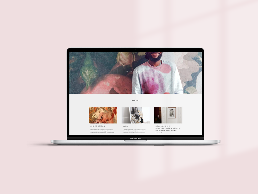
The DOK-ART website launched as a functional gallery—an e-commerce platform that treats art presentation with the same care as a physical exhibition space. The minimalist design allows Joanna's bold, colourful work to command attention without visual competition.
Ongoing updates maintain this balance, adding new work whilst preserving the curated, intentional feel. The site demonstrates that e-commerce and aesthetic integrity aren't opposing goals—with strategic design, the platform itself can enhance the art it sells.
See other work in this space:



York's only dedicated wheel-throwing studio was selling courses, taster sessions, private events and memberships entirely by email. Now the website does it.