

Hospitality & FoodSOI: Thai Street Food Pop-Up Brand Identity
Client: SOI
Project Type: Brand Identity Design
Duration: 2 weeks
A Richmond-based chef approached me with a vision: bring Bangkok's electric street food energy to life. The result was SOI—strategic brand identity that transformed a summer pop-up into an immersive dining experience."
The Design Challenge
The brief was deceptively simple: create a brand that feels authentically Bangkok whilst fitting seamlessly into a daytime café setting. The pop-up needed to stand out in Richmond's competitive food scene, communicate genuine Thai street food culture, and work across multiple touchpoints—from menus to packaging to the physical space itself.
This required balancing bold visual impact with practical application, ensuring the brand could be implemented quickly and cost-effectively for a temporary venture.
Strategic Approach: Communication-First Branding
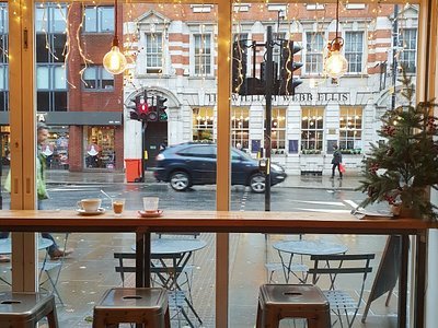
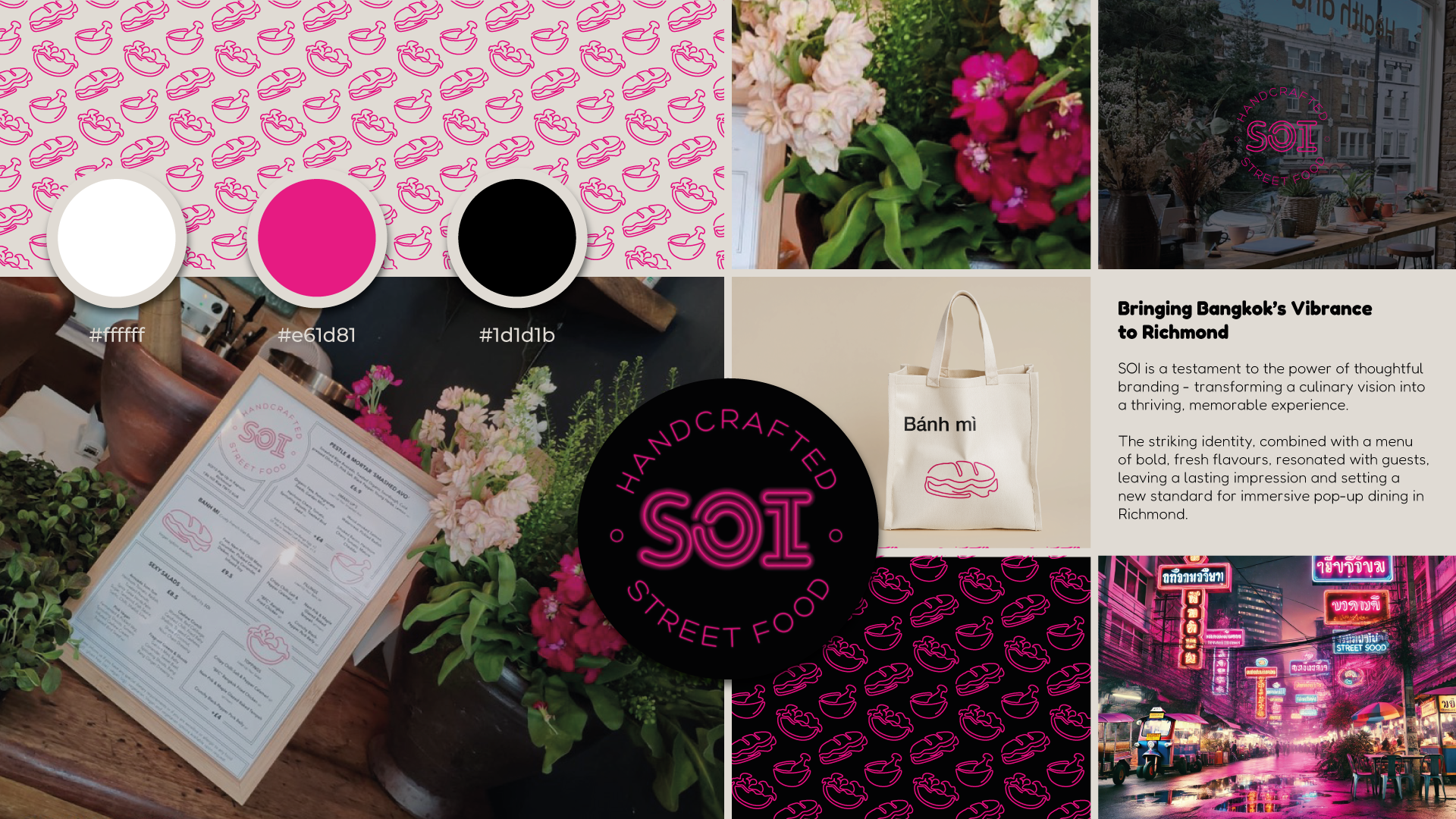
Rather than defaulting to typical Thai restaurant aesthetics, I researched Bangkok's actual street food environment—specifically the neon signage that illuminates night markets. This became the foundation for a brand identity rooted in authentic cultural reference whilst remaining distinctly modern.
The logo design subtly nods to Thai script and urban street signs without resorting to cliché. Clean, bold, and instantly recognisable—it needed to work equally well on a menu as it would enlarged on signage.
The Icon System: Functional and Visual
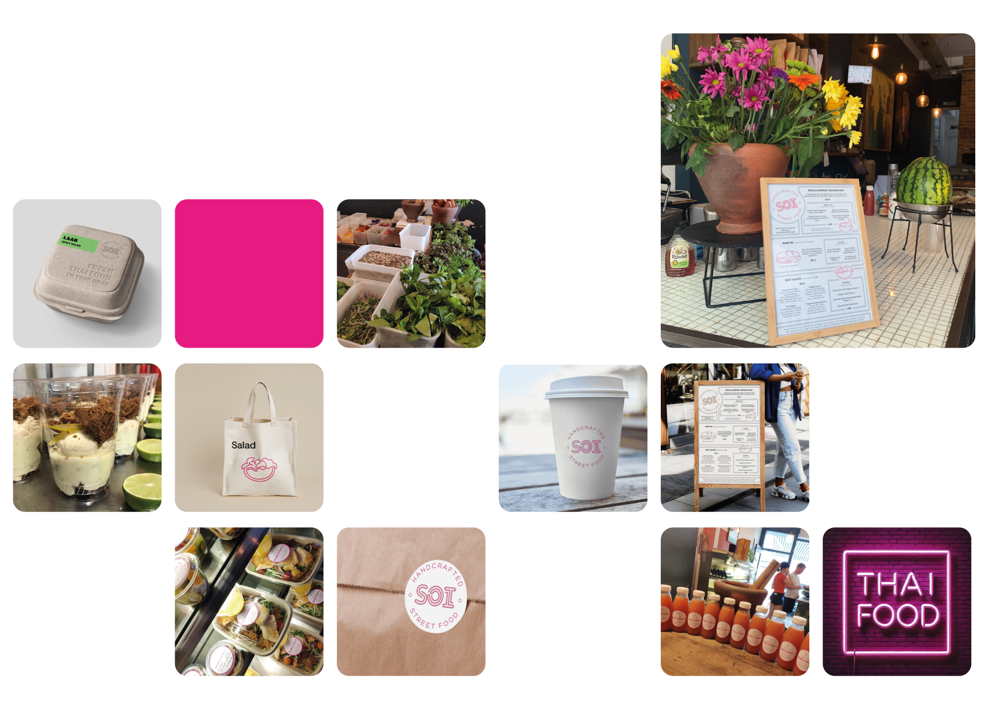
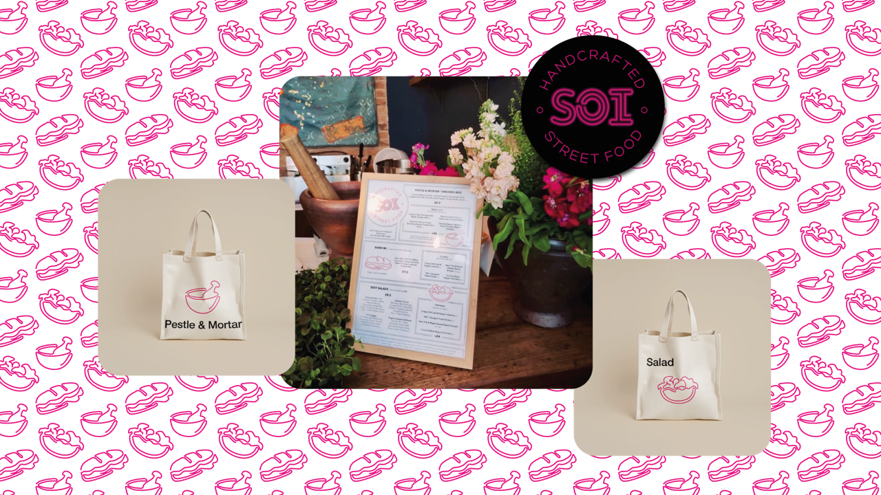
I developed three neon-style icons representing core menu items: a Thai pestle and mortar, a salad bowl, and a banh mi. These weren't purely decorative—each connected directly to the food being served and the preparation methods being used.
The pestle and mortar, in particular, became both a visual motif and a physical element. I specified using real pestles and mortars in the space as both kitchen tools and decorative elements, reinforcing the connection between brand and authenticity. This approach—where branding informs the physical environment—creates a cohesive experience that feels intentional rather than applied.

Colour and Application
The colour palette centred on an electric magenta contrasted with crisp white—punchy enough to compete with a colourful café interior, distinctive enough to be memorable. This wasn't arbitrary; the high-contrast scheme ensured legibility across all applications whilst capturing that neon-lit Bangkok energy.
I applied this system across menus, stickers, takeaway packaging, and signage. Beyond the printed materials, I provided direction on environmental elements—fresh herbs and flowers to enhance the sensory experience, packaging choices that reinforced the brand aesthetic, and an open kitchen layout that invited guests into the cooking process.
Key Features:
- Blog Setup
- Brand Identity
- Brand Strategy
- Contact Forms
- Custom CSS
- E-commerce
- Lead Capture
- Logo Design
- Migration
- Minimal Style
- Mobile Optimisation
- Organic Style
- Payment Processing
- Playful Style
- Positioning
- SEO Optimisation
- Target Audience Definition
- Third Party Integration
- Visual Identity
- Website Build
The Outcome
Customers responded enthusiastically to both the food and the complete brand experience. Feedback consistently mentioned feeling transported—the branding created an atmosphere that went beyond simply "looking Thai" to genuinely evoking the energy of Bangkok's street food scene.
The project demonstrates how strategic brand identity extends far beyond a logo. When visual language, environmental design, and authentic cultural reference work together, you create an experience that resonates.
❝ I would highly recommend Anna as a designer. Her style and design concepts are amazing. I've used Anna's services for multiple complex concepts and she has delivered every time. She is a great communicator and demonstrates a willingness that others don't. And I'll continue to work with her on my multiple food branding concepts.❞
— Paul, Founder of Bubble Hospitality and SOI
See other work in this space:



Three calm, conversion-ready Squarespace landing pages for an integrative medicine practice's New Year launch, with Stripe and Flodesk built in.