
The Monospace Secret Weapon: How to Create Eyelash Headers in Squarespace
Scroll to the bottom of your Squarespace font formatting menu and you will find a quiet option called "Monospace." Most users assume it is there for code snippets or technical blogs. Most designers scroll right past it.
That is a missed opportunity. Because buried inside that Monospace setting is a way to add a fourth visual layer to your typography — one that can elevate your site's editorial quality and improve how visitors scan and navigate your content.
This technique is sometimes called the "Miscellaneous font hack." It has been discussed by Squarespace specialists like Squarestylist and InsideTheSquare, primarily as a design approach. What makes it particularly useful in 2026 is the way it complements proper heading structure to create clearer, more scannable pages — something that benefits both human readers and the search engines and AI systems interpreting your content.
An important distinction upfront: eyelash headers are a visual and contextual tool. They are not HTML headings and do not carry the same structural weight as H1, H2, or H3 tags. They should always be used alongside proper heading hierarchy, never as a replacement for it.
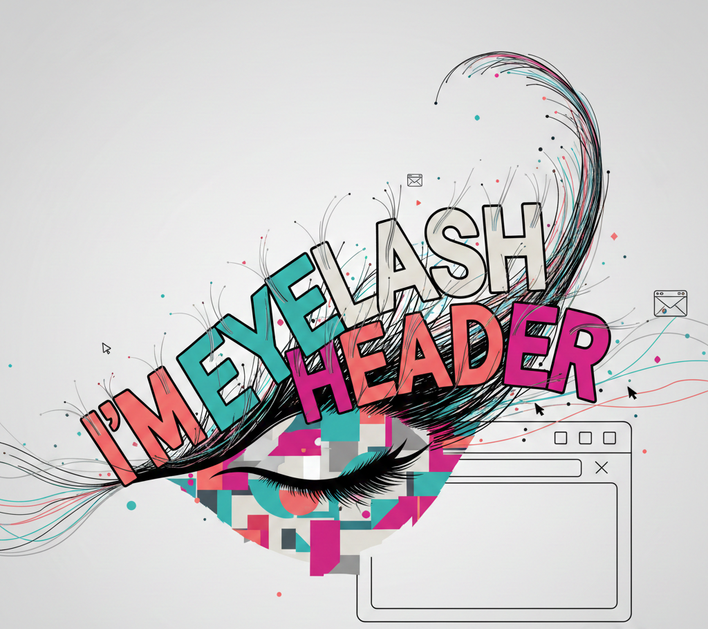
What Is an Eyelash Header?
In editorial design — magazines, newspapers, high-end publications — an eyelash header is the small, understated text that sits above a main headline. It acts as a category label or contextual tag: "DESIGN TIPS" above a headline about typography, or "NEW PROJECT" above a portfolio piece.
Eyelash headers do not carry the weight of a headline. They carry context. They tell the reader at a glance what category of content follows, reducing the cognitive effort needed to scan a page.
If you have read the companion piece on heading hierarchy, you will know that H1, H2, and H3 tags form the structural backbone of your pages. An eyelash header adds a complementary visual layer — a contextual label that frames what comes next without interfering with that structure.
The four typography layers
Case Study
How We Redesigned a SaaS Platform
The Challenge
The existing site had strong visuals but no clear structure. Users were bouncing before they reached the pricing page.
Why Scannability and Contextual Clarity Matter in 2026
Nielsen Norman Group research shows that 79% of web users scan rather than read 😶🌫️. Eyelash headers directly support this scanning behaviour by providing quick visual cues that help visitors orient themselves on a page.
Beyond human readers, contextual clarity also supports how search engines and AI systems interpret your content. As AI-generated search results evolve — through Google's AI Overviews, Perplexity, ChatGPT and similar tools — clearly organised, well-labelled content tends to be easier for these systems to summarise and reference.
This emerging area is sometimes called Generative Engine Optimisation (GEO). It is not yet a formal standard or an official ranking system, but practitioners increasingly observe that content with clear structure and consistent labelling is more straightforward for AI to parse and cite. Eyelash headers contribute to this clarity — not as a direct signal to algorithms, but as part of a broader approach to making content genuinely well-organised.
The key principle: what helps humans scan your page also tends to help machines interpret it. Eyelash headers improve the human experience first, and the machine-readability follows.
Website Users
How the Squarespace Monospace Hack Works
Squarespace's font system has three main layers: Headings, Paragraphs, and a third option called Miscellaneous (found in Design → Fonts). The Miscellaneous slot controls the appearance of any text formatted as "Monospace" in the text editor.
Here is the key insight: you can assign any font to the Miscellaneous slot. It does not have to be a monospaced typeface — and this is where a meaningful performance benefit comes in.
Every additional font you load on a website adds to your page weight and load time. It is common knowledge among developers that extra font files are one of the main causes of slower sites. The Monospace hack sidesteps this entirely if you choose to. You have two approaches:
Approach 1: Use your existing brand font (no extra load).
Assign the same font family you already use for headings or body text — just style it differently. Change the weight, size, letter spacing, and text transform to create a visually distinct layer without loading a single extra font file. This is the recommended approach for most sites, and it is enough to achieve the eyelash effect.
Approach 2: Load a new font for a different feel.
If your design calls for a genuinely different typeface — a true monospaced font for a more technical aesthetic, for example — you can assign a new font to the Miscellaneous slot instead. This adds one additional font load, but gives you a stronger visual contrast. Just be aware of the performance trade-off.
Either way, you can push the styling further with small typographic details. Copy-paste glyphs — arrows (↗), bullets (✦), or decorative markers (◆) — directly into your eyelash text to add visual character without any code or image assets. A tool like Glyphy makes this easy: find the symbol you want, copy it, and paste it straight into Squarespace's text editor alongside your label text.
To set it up:
Go to Design → Fonts in your Squarespace dashboard.
Scroll to the Miscellaneous section.
Choose your font — either your existing brand font (Approach 1) or a new typeface (Approach 2).
Adjust size, weight, letter spacing, and text transform to create your eyelash style.
To apply it to text:
In the text editor, highlight the text you want as an eyelash header.
Open the formatting dropdown (where you select Heading 1, Heading 2, Paragraph, etc.).
Select Monospace.
That text will now take on whatever styling you set in the Miscellaneous font slot.
Remember: selecting Monospace does not create a heading tag in the HTML. It styles the text visually but keeps it as paragraph-level content. Your heading structure (H1, H2, H3) must still be set separately using the proper heading formats. Eyelash headers sit above or alongside headings as visual labels — they do not replace them, and screen readers will not treat them as structural markers.
Taking It Further with Custom CSS
The Miscellaneous font settings give you a good starting point, but Custom CSS unlocks finer control — particularly for letter spacing, text transform, and colour that matches your brand precisely.
Below are two CSS approaches: one for eyelash headers and one for status pills. Each targets the .sqsrte-text-monospace class, which is the selector Squarespace currently applies to any text formatted as Monospace.
A note on stability: This CSS class has been stable in Squarespace's editor for several years, but it is not officially documented by Squarespace. If Squarespace updates its editor markup in the future, this selector may need adjustment. It is worth checking after any major platform update.
Important: These two styles both target the same class. Use one or the other site-wide, or adjust your approach with wrapper classes if you need both. For most sites, the eyelash header style is the more versatile choice.
Style 1: Eyelash Header
This creates the classic editorial look — small, uppercase, spaced-out text that sits above your main headline.
Copy this into your Custom CSS (Design → Custom CSS):
What each property does:
font-family: inherit— Uses your site's existing body font rather than a default monospace typeface.
text-transform: uppercase— Converts the text to all caps, standard for eyelash labels.
letter-spacing: 0.2em — Adds the wide spacing that gives eyelash headers their editorial feel.
font-weight: 700 — Bold weight for clarity at small sizes.
font-size: 0.8rem — Deliberately small, subordinate to your heading text.
color: #D4637A — Replace this with your own brand colour.
line-height: 1.4— Comfortable spacing if the label wraps to two lines.
Here is how it looks:
Design Tips
Get Your Font Hierarchy Right
Visual hierarchy is not decoration — it is the structure that helps Google and visitors understand your website. Here is how to set it up properly.
Style 2: Status Pill
Status pills work well for portfolio items, service availability indicators, or content labels. They create a small, rounded tag with a subtle background.
Copy this into your Custom CSS (Design → Custom CSS):
What each property does:
color: #ffffff — White text for contrast against the dark pill background.
background-color: #042D2B — A dark brand colour that makes the pill stand out as a distinct label. Adjust to suit your palette.
padding: 5px 14px — Creates the pill shape with space around the text.
border-radius: 100px — Fully rounded ends.
display: inline-block — Ensures the pill wraps tightly around the text rather than spanning the full width.
Here is how it looks:
Get Your Font Hierarchy Right
Visual hierarchy is not decoration — it is the structure that helps Google and visitors understand your website. Here is how to set it up properly.
The Typography Stack: How It All Fits Together
With the Monospace hack in place, your Squarespace site now has four distinct visual layers, each with a clear purpose:

Each layer serves a human purpose (readability, scanning, visual hierarchy). The heading layers (H1–H3) also carry structural weight for search engines and screen readers. The eyelash layer is purely visual — it enhances the reading experience but does not appear in the HTML heading structure.
This distinction matters: eyelash headers should never be the only indicator of section meaning. Proper heading tags are still required for screen readers and for search engines to understand your content structure.
The "Technical Mono" Design Trend
A growing number of premium sites are adopting more utilitarian, editorial typography inspired by technical and documentation aesthetics. This design direction — sometimes called "Technical Mono" — has moved from niche developer portfolios into broader use among agencies and service-based businesses.
Using the Monospace slot for structured, editorial-style labels taps into this aesthetic. It gives a site a sense of technical confidence and editorial precision without adopting a full brutalist approach. For service-based businesses, this reads as professional and detail-oriented — exactly the kind of visual signal that builds trust.
How This Works in Practice
To show how far you can take this technique, here are some examples from a recent web design project where the Monospace slot was used extensively across a Squarespace site:
Imitating a technical font without loading one. The site used its existing brand font (not a monospaced typeface) in the Miscellaneous slot, styled with uppercase transform, wide letter-spacing, and a reduced font size. The result looked and felt like a technical font — clean, precise, utilitarian — but added zero extra load time. This styled text was then used consistently for eyelash pre-headers, tags, metadata labels, and image captions, giving the entire site a cohesive technical aesthetic that matched its positioning.
Pill-style pre-headers to enrich sections. On service and landing pages, the Monospace format was styled as pills (with background colour and border-radius via CSS) and placed above each major section heading. This created a clear visual rhythm down the page — each section announced by a small, coloured pill label before the H2 headline beneath it. The effect made long pages feel structured and easy to scan without relying on heavy design elements.
Eyelash pre-headers to strengthen calls to action. Above key CTAs, a small eyelash label was added — something like "READY TO START" or "YOUR NEXT STEP" — in a brand accent colour. This did two things at once: it drew the eye to the CTA area by introducing a colour that appeared nowhere else in the surrounding content, and it added a layer of sophistication to what would otherwise be a standard button section. A small typographic choice, but one that visibly lifted the design.
Where Things Commonly Go Wrong
Using Monospace for paragraphs. The power of this technique lies in contrast. If you apply the Monospace format to large blocks of body text, you lose the distinctiveness that makes eyelash headers effective. Keep it for short labels and tags only.
Using eyelash headers instead of real headings. This is the most important mistake to avoid. Monospace text does not create an HTML heading. Screen readers will not announce it as a section marker, and search engines will not treat it as structural content. Always pair your eyelash labels with proper H1, H2, or H3 tags beneath them.
Forgetting mobile. At 0.8rem with wide letter spacing, eyelash text can become difficult to read on small screens. Test on mobile and consider a media query to slightly increase the font size or reduce letter spacing below 768px.
Conflicting styles. Both CSS examples above target the same .sqsrte-text-monospace class. If you want eyelash headers and pills on the same site, you will need to add a wrapper class or use different selectors. For most sites, choosing one approach is cleaner.
A Visual Choice That Supports Better Structure
The reason this technique is worth understanding goes beyond making a page look more polished. In an environment where both human visitors and machine systems benefit from clearly organised content, even a small typographic choice can contribute to how well your pages communicate.
Eyelash headers improve visual hierarchy, contextual clarity, and content scannability. When paired with proper heading structure, they make your content easier to understand for everyone who encounters it — whether that is a first-time visitor, a screen reader, a search engine crawler, or an AI assistant generating a summary.
That is the real value: not a hack for rankings, but a design decision that supports better communication.
"I have always loved the 'Monospace' hack because it feels like finding a secret room in a house you have lived in for years. It is that little bit of extra polish that makes a site feel bespoke rather than 'out of the box'."
- Anna
FURTHER READING & REFERENCES
Squarestylist — The Hidden Font Hack to Get the Editorial Look in Squarespace — Rachell De Luna's walkthrough of the Miscellaneous font technique for editorial typography.
Glyphy — Copy & Paste Symbols and Glyphs — A free tool for finding arrows, bullets, decorative markers, and other Unicode symbols to paste directly into your eyelash headers and labels.
Squarespace Help Centre — Styling Text — Official documentation on Monospace text formatting and the Miscellaneous font slot.
Squarespace Forum — Changing Monospace Font in Squarespace — Community discussions on targeting .sqsrte-text-monospace with custom CSS.
Nielsen Norman Group — How Users Read on the Web — The foundational research on scanning behaviour and why visual landmarks improve content engagement.
Search Engine Land — What Is GEO (Generative Engine Optimization)? — Explainer on the emerging practice of optimising content for AI search systems.
Conductor — The 2026 AEO/GEO Benchmarks Report — Industry data on AI search visibility and the role of structured content in generative answers.
If you found this useful, these might be worth a read too.


Want insights like these straight to your inbox? Subscribe below. 👇🏼